“A picture is worth a thousand words.”
– Frederick R. Barnard, New York based Advertiser
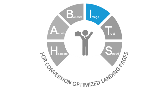
When you visit a landing page of an E-Commerce website, what is it that catches your eyes first? Is it a long description of the product or the image that describes it? Yes, it is the image and that’s precisely why Mr Barnard declared that “A picture is worth a thousand words”. The right kind of landing page images can drive sales because they resonate better and much quicker with viewers than the copy. When used innovatively, landing page images can increase your conversions, but if used poorly, they can kill conversion. After discussing about the 10 Commandments of Writing Headlines for Landing Page, Landing Page Call to Action Buttons that convert & Highlighting Benefits: Landing Pages Best Practices, I come to the next point in our HABITS framework which is, 8 Ways in which Landing Page Images Increase Conversion.

I) Use relevant landing page images
Choose wisely! Your landing page images are for lead generation and nothing else. Include an image that goes along with your campaign objective and conveys the right marketing ideas. Context matters. If you are showing an image of the product in your landing, show it in context. If you are advertising yoga classes, show someone practicing it. Let the customer imagine himself practicing it. Your goal is to make the visitor choose between converting OR returning to the home page.

Irrelevant images will only distract your visitor from taking action.
II) Use relevant videos to engage visitors
Apart from using landing page images, make sure you also use videos to engage your visitors. Just like images, it is the visual or the pictorial elements in videos that speak to visitors and help them connect. Videos are interactive, engaging and time-saving. Videos help marketers connect better with their audience and make the messaging more appealing. Here is an example:

Here’s why landing page videos are better conversion tools:
1. People stay for longer on your landing page giving your message a little more time to sink in.
2. By featuring yourself or company employees in the video, you increase the trust factor.
3. People like to watch a video more than read.
(However, I am not disrespecting the fact that landing page copy is unimportant. It is equally important.)
III) Use high quality images
Also, your landing page images should be of high quality. The explanation is simple. Put yourself in the shoes of your customers. What is it that you think when you see a low quality image? “If it does not look good online, I am sure it will not look good for real!” There, you have your answer.
IV) Keep it clutter free
Go easy with the use of images on your landing page. Stick to your color scheme and use minimalist images. You will not want to overwhelm the visitor with too many images on your landing page that are jarring to look at.
However, this does not mean that you make your landing page bland. It should be visually enticing. Less yet powerful imagery will trigger your visitors to act on your offer. Check out this landing page, there is just one main image (the boat), but the imagery is bright and enticing…makes the visitor say, “I definitely wanna go here!” It does make travel look so appealing, doesn’t it?

V) Use white space sensibly
Sticking to the minimalist theme, good landing pages should be clean with plenty of white space. Remember, your landing page acts as your sales pitch and it needs to deliver. Providing white space gives visitors space to think and of course also makes it visually appealing.

A clean design and white space in your landing page also has a psychological affect on them. They know that your product will make life easier for them and not more complicated.
VI) Use directional cues for landing page images
Directional cues are visual indicators on landing pages which guide customers toward what you desire them to do. They help marketers to communicate the message better. How? Using a gaze, an arrow, a road leading to a destination etc can be very effective in guiding your viewers gaze towards the product or the contact form. If the image on the landing page is looking at the main content or the form, our eyes automatically shift gaze. Our attention is guided to the key content and we actually read the info.
If the image is looking straight at us, we will simply look back at them and nowhere else.
In this example below, where do your eyes take you? Yes, after you have seen the pretty girl, you will wonder, what is she looking at? Thereby, your gaze will be led to the form, you will read it and who knows, you may even fill it up.

VII) Use human photos to increase conversions
Yes, we all know this equation…human images on landing pages = enhanced conversion. This is just a hypothesis or is it really true? Yes, it is. When people see human photos on landing pages, they connect with them at an emotional level. This drives people to fill the contact form. The feeling is not very strong if they are staring at just a product image.

Adding photos of people along with the phone numbers on landing pages also increase conversion. This also holds true for using photos of customers on landing pages.

Similarly, studies have also shown that landing page images of kids, women and attractive people make visitors pay more attention. This is not just true for landing page images, but daily life as well. When we see a baby, we try to make funny faces to make him laugh, don’t we? Likewise, when we see an attractive person, we pay more attention. It is the same psychological effect on people when they see babies or women as landing page images.

Can you argue with this face? Images of babies are liked by all no matter where you are from. They invoke a natural emotion in people which may urge them to fill your contact form.
However, refrain from using cheesy landing page images of women. They will not sit well with many.
VIII) A/B test
I have said this time and again, and will repeat it once again – A/B test your landing page images. Test which landing page is faring better by changing just one aspect of the landing page, in this case, the image.
Images on landing pages are arguably a very important aspect of it. I hope you liked the article. Please do share your thoughts by leaving me a comment.


