Suddenly, website redesign seems to be the de rigueur of 2014. It’s a good thing really; people realizing the importance of adopting newer, more customer-centric website design. We know this, because many of our clients are in the process of website redesign right now, and, get this, they understand that website redesign is much more than just aesthetics now – here’s your voila moment for today, marketers!
If you are also considering a website redesign, here are a few things that you must keep in mind while you go ahead with your plan.
But first, have you mapped your reason for the redesign?
I am sure your reasons for redesign have been laid down straight, before you plunge into the act. This is very important because your website redesign strategy would depend on your motive, and you would be able to give your designers a much better goal statement for what you expect from the redesign.
Following are the most common goals of website redesign
a) A newer look for the website – especially when competitors change their website
b) Aligning the website with changing brand image
c) Improve the usability/user-friendliness of the site
d) Improvement in search rankings
e) Improving website conversions
f) To make the website responsive
So, probably you also fall under one, more or all of these categories. But, you must remember is that doing a redesign just for the sake of a redesign, your competitor’s website change, or just aesthetics is not an ideal thing to do. There are multiple things to consider, besides cost and the actual design. You should look at your website’s existing statistics, and then plan out your redesign accordingly.This is where consulting with experienced UI UX design agencies can make a significant difference. These agencies can help analyze your website’s existing statistics, and craft a redesign strategy that’s not only visually appealing but also data-driven.
And while you are at it, consider these small things as well to actually see better website metrics post-redesign
1) Is your site too slow?
Many times good user experience take a blow right at the moment a visitor lands on your website.
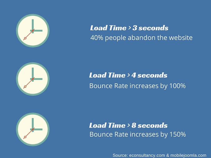
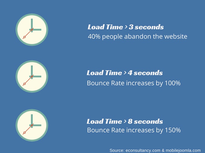
How many times have you abandoned a website that took even 1 microsecond extra than your patience permits? Apparently, the patience limit of most people browsing the web is not more than 2 seconds.
So, while you are out there redesigning, take sometime to find and fix your website’s speed issues. Here are a few things that would help:
a) Analyze your website’s load speed
Make use of Google’s Page Speed tools to find what your website’s loading time is, and what are the elements increasing the loading time on each page. Next – fix the problem elements while doing the redesign.
Here’s an example of how that would look:
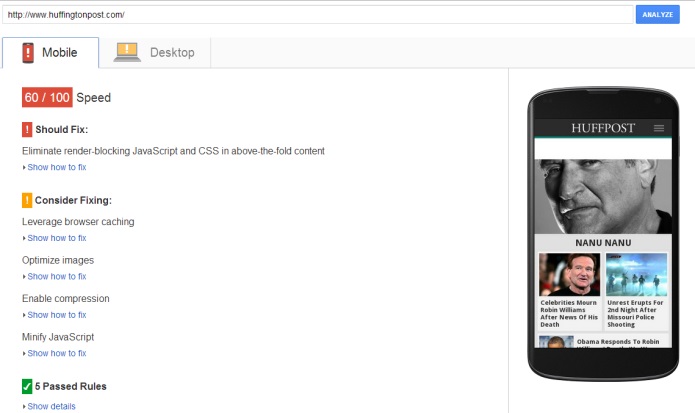
As you can see in the image above, Google shows not only the problem areas but ways to fix them as well (both for mobile and desktop). Also, it shows what you are doing right. You can use Pingdom for the same purpose as well.
b) Choose an appropriate hosting plan
If you have opted for a low cost hosting plan, chances are that you would see mediocrity in response time as well, which means low website speed. So, choose a plan while thinking of the number of visitors you expect to see on the website, and if you are anticipating an increase in visitors, make a choice accordingly.
c) Reduce the number of external resources required to fetch data
When your website loads, the browser has to look for the IP Address corresponding to your domain name. Now, if you have quite a bit of external website data on your home page (like YouTube videos, etc.), it would have to look up the corresponding IP Addresses for that domain as well. So, try to minimize the use of external resources to display content on your website.
d) Reduce the number of redirects
Redirection is a very important exercise, especially if your domain name has changed or is going to change (which might be possible during a complete website overhaul), but if you have redirects over redirects, i.e. redirecting to links that further redirect elsewhere, your page speed is going to suffer.
e) Reduce the image size
Try not to use external urls for images, and use tools like SmushIt to reduce the image size. This would improve your page load time.
f) Get Rid of Broken Links
Use tools like BrokenLinkChecker and W3C’s LinkChecker to periodically monitor your website for broken links.
There are many other things you can do to optimize your website for a better load time, but this would give you something to start with.
A navigation structure with too many levels (drop-downs), or too many elements on the first level can be really confusing to the visitors, unless you are an e-commerce site. So, now that you are doing the website redesign, look at your navigation structure as well. Here are a few things to keep in mind.
1. Your navigation labels must not be generic
Instead they should be descriptive of what you do.
2. Avoid too many navigation items
Emphasizing Everything = Emphasizing Nothing.
This holds true for everything on your website, including the navigation. If you have too many navigation items, it would just confuse people. Instead, check the navigation items getting clicked the most – you can use a tool like CrazyEgg to find this. While you are working out your new website navigation structure, try to retain the most popular navigation elements. Also, make a call, and keep only the most important pages as top-level navigation items.
See, if anything in the navigation is redundant, and to do away with it in the redesign. Instead, place them in the footer or some other secondary navigation.
3. The First and Last Effect
Place the most important items either in the beginning, or towards the end.
4. Don’t use images in navigation
Instead of using button images, use simple text and links. There are many reasons why this is the best thing to do. Button Images would take more time to load, thus increasing page load time. Also, text is more SEO friendly than images.
Here’s an example of a pretty neat navigation structure. Creative portfolio and self-promotion website for visual artists, Behance won 2014’s Webbys Award for best navigation structure, and here’s what they have:
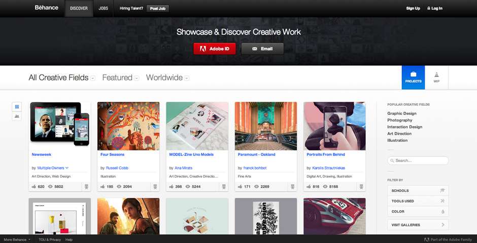
1. As you can see, the primary navigation is pretty straightforward, with only 3 items – Discover, Jobs and Hiring Talent
2. The secondary navigation has mega-dropdowns, because of course there are a lot of relevant categories under it.
The best part of the navigation is clarity and simplicity. Of course, coming from Adobe’s family, it is a good looker as well.
What is important for you as a navigation item would depend on what kind of a business you are. If, for example, you are an online training provider, your Courses would form a much important navigation item than your About Us section. However, if you are a SAAS company, then your Product and Pricing pages might be the most important ones.
3) Are your Conversion Paths Optimized?
Improving website conversions is one of the goals common to almost everyone redesigning their websites, and optimizing your conversion elements, i.e. CTAs, Web Forms, Landing Pages, Resources section etc. would help you achieve this.
Review your conversion paths
The first step to self-improvement is identifying the problem. To identify your conversion problem areas:
a) Review your existing conversion paths,
b) Find the problem points, and
c) Map out more logical conversion paths.
i) Analyze the CTAs
Use Analytics to look closely at the pages where most drop-offs are happening, pages with the best/worst Goal Conversion Rates (you should have Goals defined in this case – E-Books Downloads, Product Price Inquiry form fill etc.). Now analyze these pages – use CrazyEgg once again. See whether the people are actually clicking on your CTAs. If not, what can be the probable reason:
i) Maybe, the CTAs are not perfectly aligned with the content.
ii) Maybe you have a bottom-of-the-funnel offer on a page attracting top-of-the-funnel traffic.
iii) Maybe the CTA doesn’t stand out amidst the clutter.
ii) Analyze your Forms
Now analyze your Forms – are they working as they should. If it’s a document download form, are the downloads happening properly etc.
iii) Analyze your landing pages
a) Make sure that CTAs don’t point to broken links
b) Look at your landing page conversion rates
c) Make sure the landing page is perfectly aligned with your CTA – in terms of offer, headline etc.
d) Make sure the landing page form is working properly
e) Check the Landing Page for the different elements of the HABITS framework.
Having reviewed your content, CTAs, forms and landing pages, if the conversion path is not logical, or is broken, map out the changes to be made.
For your reference, here are a few good conversion elements you can use on your website:
a) Your blog sidebars, and topbars.
b) Live chat windows on the website

c) Pop-ups – Even though they might seem disruptive, they can improve your conversion rates by a pretty large margin.
4. Are you Prepared to tackle SEO backfire?
A common website redesign goal is SEO; however, many times, the redesign affects SEO adversely. You have to be smart to take measures against this. You might be planning to add a blog, and your action plan may be moving to a CMS with built-in SEO capabilities, and easy to manage interface. You need to identify the problem elements in your overall SEO structure.
Ask yourself these questions:
i) Is my sitemap proper – what changes would occur after redesign
ii) Is my URL structure going to change?
iii) Does my content read natural – is it optimized for humans?
iv) Does my content have natural placements of important contextual keywords?
iv) Other elements like site speed, navigation also need to be questioned here again.
Now, do this:
a) Note down your rankings for post-redesign reference
From Webmasters reports find out which keywords are getting traffic to your site.
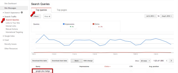
Now, use a tool like Rank Tracker, or SEO rank Reporter (if you are on WordPress) to find out what are your rankings for these particular keywords. This would help you find any drop in rankings later on.
b) Prepare to set up 301 Redirects
Are you changing the domain name, or the URL structure? Either way, you need to set up 301 redirects. If you simply delete the old URLs:
i) You are throwing away the SEO authority you have built on those pages over time.
ii) In addition, if your deleted pages rank somewhere on the web, your visitors coming through there would land on 404 error pages, thus disrupting good user experience. Not only would this bother the users, but search engines as well, that would notice the repeated drop offs from those pages.
If you have a WordPress website, then you can do this using a plugin as well, otherwise you would do it manually in your .htaccess file.
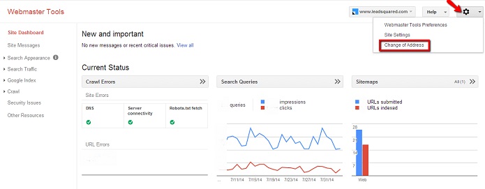
c) Notify Google of “Change in Address” if domain name changes
If your complete domain name changes, you should tell Google about this through your Webmasters, using “Change in address tool”.
d) Decide your sub-domain structure, if you are a multi-location business
If you want to assert your presence in all the states or countries where you are located, website redesign is a good opportunity to decide how you want your sub-domains to be.
i) You could choose ‘xyz.com/state’ structure, or ‘state.xyz.com’.
ii) In case of an international presence, if you have the money to claim the different domains, like xyz.in, xyz.nz etc. you can do that, or simply go for country.xyz.com structure.
iii) Even if your business is within one country, and you choose sub-domains within the same domain, you should use schema.org markup in all the location pages with relevant location details, and link all the different Google Plus Local pages. This would help you rank in the respective locations, for the relevant keywords. Read this post for more insights on the topic.
e) Resubmit your website through Webmasters
Resubmit your website through webmaster tools after you launch, and submit a new sitemap as well. You can create a new sitemap.xml file using your CMS plugins or manually.
Following these simple points would help you consider few very important aspects of website redesign. So, are you redesigning your website? What are your reasons?


