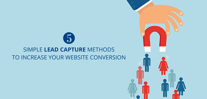
In our last webinar, Meenu Joshi, Lead – Digital Marketing at LeadSquared talked about 5 Simple Lead Capture Methods that can help your business increase website conversions. In case you missed it, you can watch the recording here:
We have also compiled questions asked by attendees at the session and addressed them below.
Question 1
What is CTA?
A call-to-action (in short also known as CTA) is an image, text or a button that ‘calls’ and prompts visitors to take an ‘action’. Call to action buttons aid in eliciting a response from website visitors. This post on CTA buttons would give you a better idea.

Question 2
We have a software services company. What should our conversion goals be?
It should be really relevant to the different pages on your website. Since you are a software services company, I’m sure you would be maintaining a blog as well. On that blog, you can aim to put up different whitepapers, e-books, etc. because that gets you the first level leads who you can further nurture and then convert into your customers. But on the website, your conversion goal would be pretty simple. You would want more people to sign up for your service. On the pricing page, you should have “See Pricing” as the CTA. On the main software service page, you should have a “Sign up for the software/service” offer (CTA).
Question 3
Are pop-ups useful?
It really depends on where your pop-up is. They have proved to increase conversions in many cases. However, the general consensus is that people find them irritating. Even if it’s irritating if your offer is really relevant to the page the person was on at that time, it will help improve conversions. You can try the following:
- Slider pop-outs: You can try slider pop-outs instead of the pop-ups that pop up right on the face of the visitor.
- Time-based pop-up: If the user has been on a page for a certain period of time (Example: 30 seconds), then you can have a pop-up there, but not before that.
- Activity-based pop-up: If the person has scrolled down to a certain length, you can have the pop-up appear in front of him/her.
Question 4
I have tried many techniques for PPC, but all I have got is clicks, no conversions at all. These are keyword relevant traffic and I get an average of 60 clicks a day. I have also changed the landing page design, but it hasn’t helped.
As you said that you are getting no conversions at all, it’s not good because you are just wasting money:
- First off, you need to check whether your audience is online or not – do a keyword research. After you create ads, Google would also suggest what keywords you should add. Make sure to look at them, and add if they seem relevant.
- You should create multiple ad groups targeting different services that you offer, and then highlight only one offer on the landing page. Listing everything on one landing page is a sure-shot conversion killer. Therefore, create as many ad groups/landing pages as you have services.
- Headline/copy should match with your ad copies.
- You should constantly monitor the keywords getting you the traffic, and mark negative keywords (the keywords that are not relevant)
- Run remarketing campaigns, if your traffic seems relevant (look at the search terms). This is an old post that we wrote; the steps might have changed a bit now, but it will give you some idea: https://www.leadsquared.com/google-remarketing-step-by-step-guide-beginners/
- Add trust elements – testimonials/some 3rd party verification that you have
- Make your landing pages responsive if you are targeting mobile.
Question 5
We are offering water heater repair services. Should we have a CTA on a particular landing page or can we use it on every page?
Ideally you should have different offers on different landing pages. It will depend on the context. For instance, in case of Adwords, your Adwords copy would say – this is the offer that we are going to give you. The person clicks on that ad. Then if your CTA is perfectly aligned with what you advertised on the copy of the ad, the person is more likely to fill it up over a generic sign up form. The offer should change accordingly based on the kind of variations you are using to promote your offer. The same offer on every page will not work. The context that you are using maybe the same, but the words on the offer will affect the conversion rate.
Question 6
Does using a mega menu or a normal drop down affect the speed?
It doesn’t really affect the speed. It might have a positive/negative impact on how navigable your visitors find your site. In case of many e-commerce sites, you would have seen that they use mega menus all the time because mega menus are actually beneficial for them. However, if you are not an e-commerce website or you do not have that many services, then using a mega menu is kind of distracting.
Question 7
A new financial blog has a bounce rate of approximately 80%. Any particular suggestion for a global financial blog to control its bounce rate?
You should start by identifying the keywords people are really looking for. I’m sure you are getting some traffic. Make sure you are not using old-school SEO techniques like stuffing the keywords in. Try writing more “How to” or “Why” articles. That will have contextual relevance to the people who search for something and come to your blog.
Many times the analytics data, the bounce data that you see might be faulty. You need to do quite a few things to actually see that the bounce rate you are getting is accurate or not. Sometimes you might get hit by link spam which may bring up the bounce rate of your site.
So you have to first identify whether the bounce rate that you are seeing on your website is accurate. In your webmaster, you’ll be able to identify the kind of keywords that is bringing traffic to a particular page and you’ll get information on what kind of articles you should be writing so people stick around longer.
Question 8
What is white space?
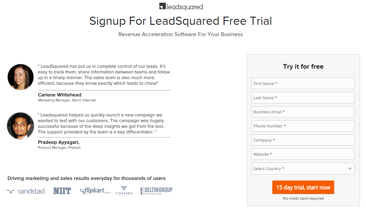
White space may refer to empty or ample space around your CTA so that the CTA is more visible. Take a look at this landing page:

Notice “15 day trial, start now” – there is enough space around it so that the CTA is not muted.
Question 9
We have invested almost $700 on our landing page, but we haven’t got a single conversion. What could be the reason?
Having seen your landing page, these are my suggestions:
- It’s a little too generic – you have listed down all your services on top. Instead, you should create different ad groups with different focuses, like “Website Design”, and then center the whole landing page around that or Web Development, and then center the landing page around that. Listing so many services right on top would dilute the context of the landing page.
- There’s way too much text above the form (this would be fixed if you make your landing page service specific) – it affects mobile conversions a lot, because for two scrolls people see nothing but text.
- The value proposition is not there
- There are no credibility elements – have some testimonials. You have a portfolio, but that gives very little info.
- The CTA text says “Submit” – it’s not the best CTA to have because it drives no action for them – Have them ask for a callback or “Send me a Quote”
- Have as many landing pages as your ad copies (services) – there are many search results for your keywords.
For tips on PPC landing pages, this post should help you out.


