Before getting into the details of landing page design, it is of vital importance that you understand its purpose. Let us dive in, shall we!
What are Landing Pages?
If you have hung around the digital marketplace long enough, you probably know this already: Landing Pages are specially designed pages where you want your campaign traffic to “land”.
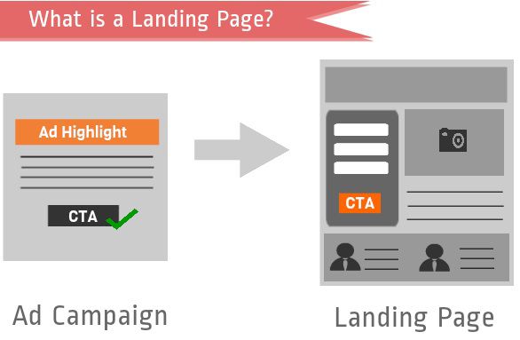
Are Landing Pages Important?
Yes, without a doubt! Your ads may have the best copy on the web, but without an optimally designed landing page, they will not get you conversions. I have seen marketers create great ad campaigns, but link them to their website homepage. This thought brings us to the very first rule of landing page creation:
No matter how great your website is, directing campaign traffic to your homepage is always a mistake.
Now, why did I call directing your campaign traffic to website a mistake? There are multiple reasons. I would give you just 2:
1. Websites in general have great amount of information, and not one specific action driver (example: form to fill) as focus. This information overload results in distracting the visitor away. Therefore, even though you are wasting clicks on your ad, you are unable to capture the lead information.
2. Your campaign visitor had clicked on your ad with one specific intent, maybe to “Signup for Spanish Classes” as you had specified in your ad. But, when you redirect them to your Language Training Website, with details of French, German and other courses, they would be lost, without a specific action to take. Result: They “might” be driven away from the website. You don’t want that.
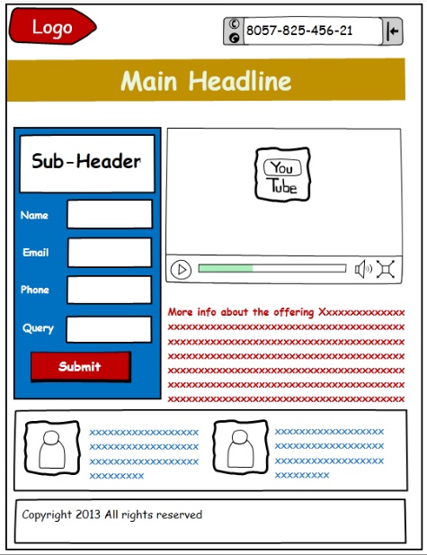
The best bet is to create standalone-landing pages equipped for conversion. This is how a simple landing page aimed at lead capture would appear.
How to Create Landing Page Designs that Work?
We have compiled a list of 15 best practices that would help you come up with great landing page designs. However, I would discuss only five in this article. The others would follow; stay tuned for that!
1) Define the Landing Page Objective
Any marketing activity without predefined objectives is like shooting blindfolded. A landing page is no different. Therefore, the first step in creating a landing page is to set a goal. You will see that with a clear purpose, you would do a better job with the landing page design and copy as well. Initially, even an arbitrary goal would do. For instance, your goal could be to capture the vital details of people interested in SEO services.
2) Relevance
Remember, “A generic sales pitch is as good as no sales pitch at all.” A landing page is nothing but a sales pitch: if it has not been designed keeping the prospect in mind, it will fall short of its objective of capturing his/her attention.
What can I do to keep the landing page content relevant?
i) Don’t use generic landing page design ‘or’ copy
Quit linking all your campaigns to a generic landing page. Instead, model each of your landing pages on the ad/campaign that brought the prospect there.
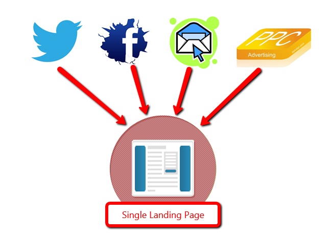
A single landing page design for different traffic sources is not a good idea.
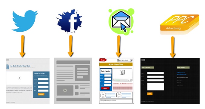
If you have customized your landing pages for traffic from various sources, you would do a better job of capturing your visitors’ attention.
ii) Message match
If the visits are through an ad campaign, there must be congruence in the message conveyed in the ad and on the landing page. Ensure that the main headline of the landing page reflects the message conveyed in the campaign.
Here is an example of a bad message match:
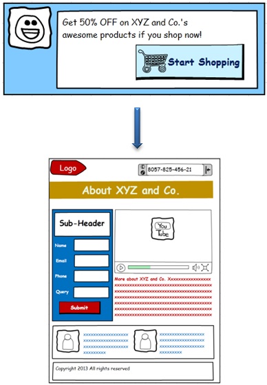
The ad copy promises the visitors 50% discount on XYZ and Co.’s products, whereas, the landing page linked to the campaign has no mention of the offer at all.
Luring prospects onto your landing page with one promise, and greeting them with something entirely different would do nothing but adversely affect your credibility.
3) Rethink that Navigation Bar
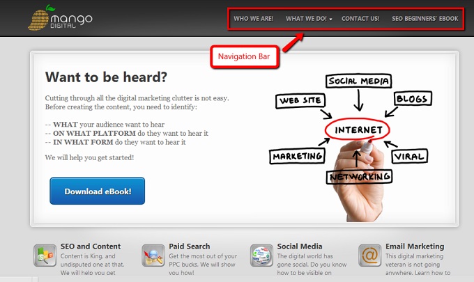
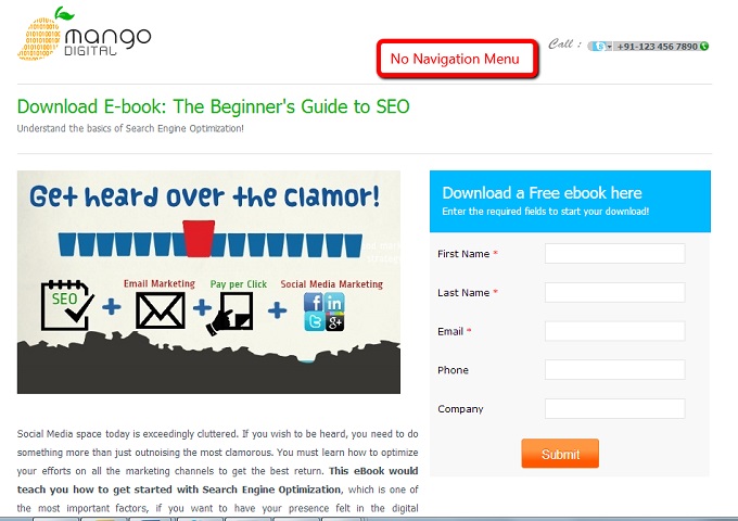
You have the potential customer right where you want them; tread wisely now! The landing page does not need all the navigation links that are otherwise there on your website. Having distractive elements of any kind on the landing page is like showing the visitor the door. You are making it easy for him to navigate away from the landing page.
Look at the images below. On the website there is a proper navigation bar, however, on the landing page, the navigation bar has been removed to avoid distracting the visitor.

4) Stick to One Point
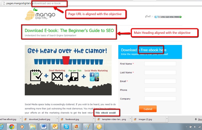
A landing page should ideally have just one objective. Each element of the page (title, copy, video/media element, etc.) should be tightly aligned with the said objective.
For instance, SEO eBook download, which is the main keyword in the example below, has been highlighted in all the key elements of the landing page.
5) Visible CTA
The objective of the landing page must become evident immediately, along with an effective and persuasive CTA above the fold.
The CTA should stand out; for this you can use colors contrasting to the landing page background, or cues pointing to the CTA.
Let’s conclude the article with a bonus tip, shall we! Before you set out to actually design landing pages, have a system in place to analyze their performance. Only then will you be successful with the execution of Tip 1.
Keep listening folks; we will be back with more tips to help you create landing pages that work.
For now, it is your turn. Implement these tips in your landing page design, and tell us if they helped.


