“Marketing Content without a good Call to Action is like Rocket without Fuel.”
When you land on Facebook, new members are prompted to ‘Sign Up’.
On LeadSquared’s homepage, you are asked to ‘Sign Up for FREE’.
On WordPress, if you want to create your own blog, you are asked to ‘Get Started’.
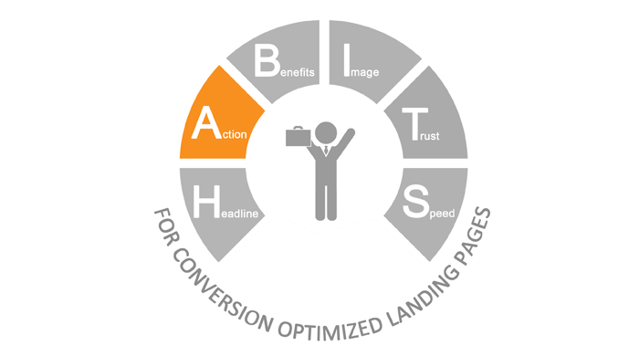
The highlighted words above are nothing but call to action buttons. After discussing about the 10 Commandments of Writing Headlines for Landing Page, here I will discuss about the ‘Action’ part in our HABITS framework, i.e Landing Page Call to Action buttons that convert.
So, what is a Call to Action?
The name makes it quite clear isn’t it? A call-to-action (in short also known as CTA) is an image, text or a button that ‘calls’ and prompts visitors to take an ‘action’. Call to action buttons aid in eliciting a response from website visitors.
The call to action on a landing page is decided on what the campaign goal is…from asking website visitors to download an ebook/piece of information/study module off the website, add products to an e-shopping cart, sign up for a free plan/trial/webinar/demo etc.
In order to increase the website visitor to lead conversion opportunity, you need to create an effective landing page call to action. I will tell you how.
1. Get your campaign objectives right
If your campaign objectives are not set, its like shooting in the dark. What is your campaign objective? Is it to to get people to sign up for something, increase ebook downloads, elicit contact details from people? Once you have decided what your campaign objective is, getting a call to action that will guide your users to the very goal that you want them to do will not be that difficult.
2. Have Actionable words on CTAs
The words you use for a call to action should entice the reader and urge him to click. The words shouldn’t be complicated. Simple words like ‘Download Now’, Free 30 Day Trial’ and ‘Sign Up Now’ etc suffice. The image below shows a few examples of call to action buttons with words that show action.
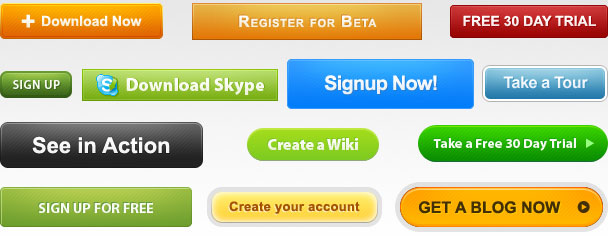
The above mentioned call to action buttons state the value (get a new blog, free trial, free tour of the site etc) of what the visitor will get by clicking the button. This way the visitor will know what he/she is likely to get thereby reducing their anxiety and increase your clicks.
NOTE: Try not to use the ‘Submit’ CTA. The Submit call to action button is almost like placing a period to the entire process. Once the web visitor has clicked on the CTA and has submitted his details, what next? What value did providing the details add to the user?
3. Have only 1 primary CTA on one page
The primary call to action on the landing page is the CTA that defines what your campaign objective is and what you are offering to your viewers in return.
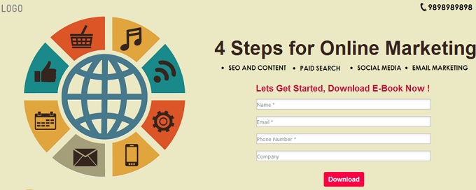
Take this image as an example – The objective is clear in the headline, to offer users ‘4 steps for Online Marketing’. Keeping this in mind, the call to action is straight to the point – ‘Download’. So when a user clicks on it, a module which gives them 4 steps for Online Marketing is downloaded on their computers.
Here is another example – Take this image below. The headline is straight to the point, ‘Admission Open for primary classes’. Hence the call to action shows a sense of urgency, ‘Book Now’, lest a parent miss the opportunity.
In the above shown landing pages, only one primary CTA does the trick and is enough for users to engage.

Landing page calls-to-action are meant to direct visitors onto one particular course of action. If there are too much CTAs in a single landing page, the main objective will not stand out and will lose its importance, thereby increasing the bounce rate.
4. Use CTAs Above & below the fold
The place where you place your call to action decides your click through rate. It should be within the vision field of a web visitor. What is the point of having calls-to-action if no one is able to see them clearly, right? But make sure, your call to action does not pop up from somewhere…that’s an absolute no-no! Pop-ups are agonisingly irritating for anyone who is trying to read through the content.
You must have your call to action both above and below the fold:
i) Above the fold: A user who never scrolls down to the very bottom will miss the call to action if you have placed it only at the end of the page.
ii) Below the fold: Placing your CTA below the fold, i.e. end of the the page, is most appropriate for users who want to read further details about the product or testimonials and only then click on the CTA.
5. Add a sense of urgency
A call to action button which has a sense of urgency (deadline/time bound) gets the consumer to think, ‘What if I miss this opportunity?’. The words used should be minimal and clear cut. This helps generate more clicks.
Phrases like ‘Limited period offer’, ‘Offer expires on August 5’, ‘Get 50% off Today only’ and ‘Now’ add to the excitement.
Example: The image shown below is that of a website that provides web templates for iPhone apps. You can see that the Call to action clearly mentions ‘Unlimited access for $89’.
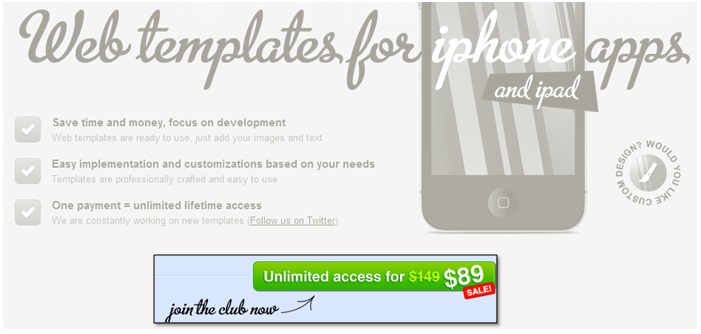
This CTA adds to the sense of urgency because…
![]() it urges people to register at the earliest lest they miss the deal.
it urges people to register at the earliest lest they miss the deal.
![]() the word ‘sale’ mentioned in red is very prominent and has the same psychological effect as any other merchandise/apparel sale.
the word ‘sale’ mentioned in red is very prominent and has the same psychological effect as any other merchandise/apparel sale.
![]() the earlier price of $149 has been mentioned but scratched out. This gets a user thinking, “I will have to pay $60 more if I take this deal later”.
the earlier price of $149 has been mentioned but scratched out. This gets a user thinking, “I will have to pay $60 more if I take this deal later”.
Here is another example. See how the CTA ‘Download Now‘, adds to the sense of urgency. The lead capture form and the headline clearly mention that only if an user fills in details right away, he get a discount coupon.

6. Keep the CTA to the point
Though a call to action is just a couple of words, it should be to the point…too many words may be overwhelming for a few. A user will not spend more than a few seconds on your website, so make sure that the CTA is easy to grasp.
Example: In this image shown below, the call to action is clear, ‘Use it for Free’. A limited and clear cut use of words makes the user decide quickly and perform the action. Think of what action you want your user to take – free trial, download, submit, register, start now etc.

However, this does not hold true for all CTAs. There are several CTAs which are long enough, but again, like I have mentioned, as long as they make complete sense and meaning to what they are trying to deliver, long CTAs are also fine.
7. Grab their attention with Size and Contrasting Color
Though this might sound a cliche, but yes, size does matter! Larger elements on a webpage in relation to the surrounding ones draw a readers’ attention better. As a marketer, you want to make sure that your readers easily see whats on offer, right?
The thumb rule is to make sure that your call-to-action is large enough to be seen but not so large that it takes away the essence of the surrounding elements. Using white space or a much lighter color around the CTA helps the call to action to stand out.
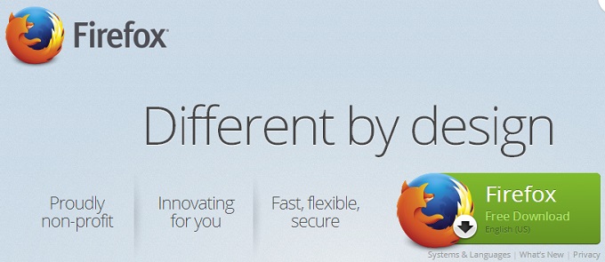
Example: The image below is the homepage of Mozilla Firefox. See how the call to action for Firefox free download is almost the similar size ‘or’ larger than that of the company logo. The contrasting green color against the light background helps the call to action to stand out. But, the colors used are subtle, not jarring to the eyes. To much color by all means will lose the importance of the CTA.
8. Use Contact number as a Call to Action
Implementing a phone number call to action makes it easy for visitors to take an action immediately. If you want them to know you, make it easy for them to get in touch with you directly. By strategically placing a phone number, you will increase your chances of getting leads.

Tip: Include incentives like ‘Call us today for a free quote,’ ‘Call & mention our website for 10% off ’ to increase your chances.
9. Use Directional Cues
Look at the image first. What is it that grabs your attention first? Color, YES, the design, OF COURSE….then? Yes, the arrows that point toward the calls to action.
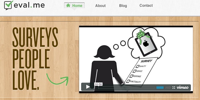
Wonder why? I will tell you why. As humans we are programmed to understand the purpose of our eyes and where they are looking at…a stare, a glance and in which direction someone’s eyes are looking at or which way an arrow is pointing toward. Its gives us a sense of direction and guides us to look and concentrate on the more important aspect of the landing page, which is the call to action.
Curiosity also plays a part in directional cues. We are curious to know where the person in the image/arrow is pointing toward. Pointing arrows towards videos (as shown in the second image) are also an effective way of call to action.
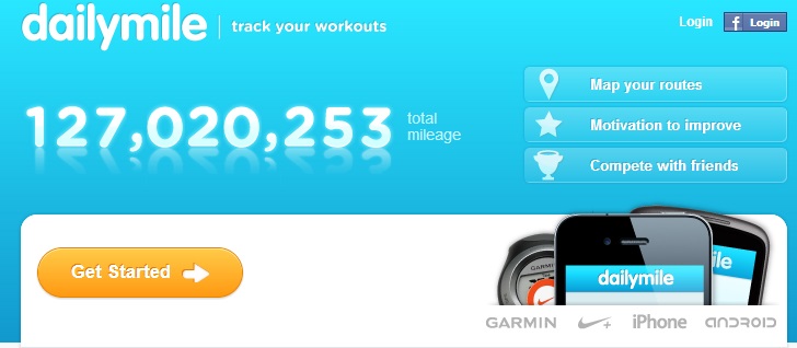
Here is another example:
10. Have CTAs that add credibility
Talk to an Expert: If you have someone of authority available at all times to speak to users with query, ‘Talk to an Expert’ CTA is a great way to provide credibility.
Become one of our 1 lakh satisfied Customers: A user will be hesitant before filling up a form or buying something off the internet. This kind of a CTA, which shows them that you have lots of satisfied customers provides them a sense of relief. They know that, there are several others who have come before them and have done what they are about to do.
Free Consultation – This gives users a sense of intimacy and that you are offering free information.
11. A/B Test your CTAs
Once you have decided upon your call to action, A/B test it. Determine which words, position, color, font, design etc are getting people to take most action.
With the right call to action, you can make or break your marketing strategy. It effectively engages the audience, offers value and generates more leads. Are your calls to action effective enough? Do share by dropping me a comment.
