“Never pressure people to PUSH them into purchasing. Instead, use pressure to PREVENT them from procrastinating.”
– Michel Fortin, Marketing Blogger
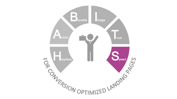
How often do we come across, “Don’t call now!” or “No more seats left”…let me think…NEVER! Calls to action or headlines always read, “Hurry”, “Last 10 seats lefts” or “Call now to get XYZ% off” and so no. Why? Its human psychology. People don’t like missing good deals. So, when marketing gurus launch a product and declare that it is ‘exclusive’ or is available for just a few more hours, it creates a sense of urgency that make people think, “If I don’t buy this now, I will loose the deal forever!” The strategy is to get someone to convert from “this may be a nice product” to “I have to buy it right now!”. After discussing about Headlines, Call to Action, Benefits, Images and Trust for landing pages, I come to the final point in our HABITS framework, Speed or Urgency, i.e., 5 Ways to Increase Landing Page Conversions with ‘Speed’. 
I) Make it sound URGENT!
Don’t delay
Act now
Hurry!
Call today
Call now
Words like these work on people’s sense of FEAR. Induce FEAR in the mind of your prospective customers. Wait, I am not saying you beat up customers and force them to buy…but induce the FEAR of LOSS in them. This acts as a motivator in all of us.
A mother who wants her son to clean up his room induces fear in him by saying that she will throw away anything she sees on the floor! Fear is a negative emotion that induces the positive activity of motivating the child to clean the room.
Again this is human psychology; tell them they are losing something important and they will have a stronger urge to buy it ASAP. Why does this work so well? That’s because, no one likes missing out on great or more so ‘exclusive’ opportunities.
II) Add a Countdown timer
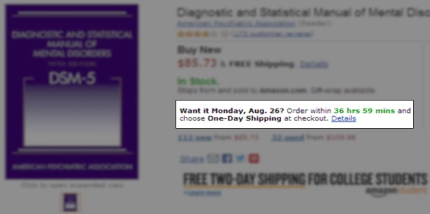
Have a timer displayed on your landing page, counting down to the time when your offer will expire. This will motivate the reader to act right then. This tactic is particularly effective when marketing messages advertise short-term promotions, registration for events like webinars and presentations etc. The countdown offer can also be clubbed together with a “order before” marketing campaign. Almost like a time bomb, these trigger a pressure point in prospects to encourage an immediate purchase.

Then again, I may be interrupted here by a few graphic designers who may say that timers are a distraction and take the readers attention off the lead capture page. Yes, they may be right to an extent. But, adding a small timer just above or below the lead capture form also allows visitors to see the timer and without any haste fill the form lest they miss the deal.
III) Add a sense of Scarcity
For a limited period only
While supplies last
Available for 500 early birds
One-day sale
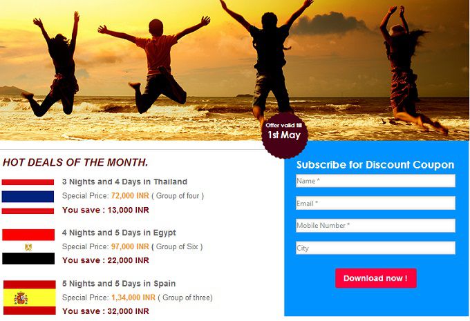
We are all attracted to these kind of messaging aren’t we? It is human nature to see whatever is exclusive or for limited period only as high value. Use this to your readers’ advantage. Here is an example:

The example above shows the headline which reads ‘50% discount for 500 early birds’. This triggers an urge in visitors to be among the first 500 people to fill in the form and avail the discount.
IV) Mention urgency in Calls to Action
Call Now
Sign Up Now
Enroll Now!
I have already mentioned this in the article on landing page call to action buttons and will do so once again. Adding urgency to your landing page may not suffice. What if the visitor sees the headline, browses through the benefits but does not click on the call to action button and bounces off your site? All your energy goes waste. Here’s what you do. Add a sense of urgency to your call to action button as well. Give it that extra edge with actionable words like ‘Now’, ‘Click HERE’ etc. This will not just stimulate them to click on your call to action, but also act on the spur of the moment.

Such call to action buttons which have the urgency factor in them work really well for E-Commerce sites, game/concert ticket sales etc. Now, do you see why most offers are time bound or ‘exclusive’ and ask people to act right at the spur of the moment?
V) A/B Test
Last but not the least, try which landing page is faring better by changing one aspect or element at a time.
However, you need not add all the above mentioned elements for urgency in one landing page. Just add them wherever you deem they are necessary. Now, that I have covered our HABITS framework in detail, do share your thoughts with me by dropping me a comment.
Also, here is an e-book to help you create conversion optimized landing pages.


