Last weekend I ended up in Chikmagalur with friends – completely impromptu.
To give you some context, Chikmagalur is around 240 Kms from Bangalore, is called the coffee land of Karnataka and to misquote Elmore Leonard, gets by on its good looks, unlike Bangalore that has to work for a living.
This is what I mean.

While we drove down, we somehow managed to book an accommodation (wasn’t easy – every place seemed overbooked).
The nice people at the hotel/homestay/resort sent the address to me via text, and I thought we were all set.
That’s when the misadventures began.
Four hours later, as we entered the town, I set the “Resort, shall we call it Hotel Elusive” as the destination on Maps, and followed the directions. The maps led us to an area that definitely wasn’t our destination (there was no trace of civilization anywhere in the vicinity). I called the folks at Hotel Elusive, who informed me that the place had shifted.
My bad; I should have called them first; maybe I should not have relied just on maps and double checked the address that they sent (which I half-tried, but everyone we could find at that point either did not speak the language or did not know the address).
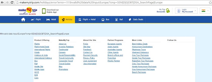
But, my experience was disrupted. They had a broken link somewhere – Map leading to an address that had shifted.
Landing page experience mistake #1
Leading your users to the wrong address
How often have you landed on a broken link after clicking on a search ad? Something of this sort:


I bet even more frequently you would have landed on a homepage after clicking on an offer specific ad; finding that specific offer in the jungle that’s an average website is frustrating, isn’t it.
But, are you making the same mistakes in your own campaigns?
If the user is really patient, he’ll try to find the right page, despite the bad landing page experience. We did that by the way – called our Hotel Elusive folks, and drove another 12 Km to get to the place.
But, in most cases, the user is not that patient, and really, it’s not “you” they are looking for. It’s a solution to their problem. We were looking for an accommodation too; not particularly that address – just that we didn’t have an alternative.
On our drive down, I was continuously trying to call other places trying to find an alternate. (See, the trust had started to waver.)
But, that didn’t happen fast enough.
So, we were now in the correct area. The only problem now, there were no signboards anywhere directing us to the place.
Also, it was in the middle of nowhere, so all our phones had lost signals too. Each time we wanted to get directions, we’d have to drive out to a particular area, where our phones were functional again, make the call and go back down the same road again.
Landing page experience mistake #2
No cues/clear message on the next course of action
After the users land on your page, inform them in simple language of the next course of action – what to do, where to go. That would improve the landing page experience of your users. Again, online users are not that patient.
Anyway, in the meantime, on one of those trips to the “functional mobile” area, I managed to get a booking at another resort (I had an alternate now – the conversion opportunity is slipping).
However, by now, Hotel Elusive’s owner had sent someone out looking for us, so we went in to check out the place anyway.
However, once inside, we were confronted with yet another problem. Instead of a 3-seater room, they had booked a small one just enough for 2 people.
And, because they were so packed, didn’t have an extra bed either. I get that they were overbooked, and it’s great, but it would have been in the good interest of everyone involved if we were informed of the fact.
Landing page experience mistake #3
Not giving what you advertise
Now, I am not the one to throw a hissy fit over an extra bed, but they had lost us right at the second mistake, hadn’t they, when we got that other place to stay. We were suddenly not in a fix anymore; we had another alternative, and so we headed there, and they lost our business.
So, yes, deliver what you promise on your landing page. Otherwise, you’d lose credibility for a second chance.
I have been a part of marketing for some time now, and we talk about good landing page experience – clear messaging, focused offer, one-directional navigation etc., on a daily basis.
But, as the saying goes, unless you have been on the other side of a problem, you don’t truly understand the gravity of it.
We lost 4 hours of our travel time in the whole fiasco and came out with a bad experience with good old Hotel Elusive; maybe visitors to your landing pages are facing a similar problem too.
Fix it.
(P.S: Check some other PPC landing page mistakes you might be making)


