While discussing how to create landing pages in our previous posts, we have mentioned that Calls to Action are important. How important,we will see today.
Let us kick it old school, shall we! You announce a 30% discount in the papers (the digital counterpart would be your PPC campaign). People come swarming in to your emporium (going too far back, am I?). :) However, without proper cues guiding the visitors’ actions, what will be the result? More Bounces!
Check out the image below: Though there is a signpost for the 30% Discount Sale, people coming from the opposite direction might miss it entirely. Maybe a banner at the shop entrance saying ‘Come In to get 30% off on Groceries’ would have helped bring in more traffic.

In case of your landing page too, the visitors would bounce off to someone else’s website, if your CTAs are confusing. In newspaper ads, there was the advantage of onetime cost, but in PPC campaigns, you pay every time a visitor clicks your ad.
Therefore, marketers, time for a big kibosh to poorly designed and copy edited CTAs. This is how you can stop wasting those clicks:
How to create Landing Page CTAs that work?
1. “It is all about the Placement”
I know it’s getting old, but seriously, some clichés are clichés for a reason (another cliché, I know): This is one of them. Can it get any simpler than:
a) Keeping it above the fold, and
b) Keeping from shoving it right in the face of your visitor without any prior context
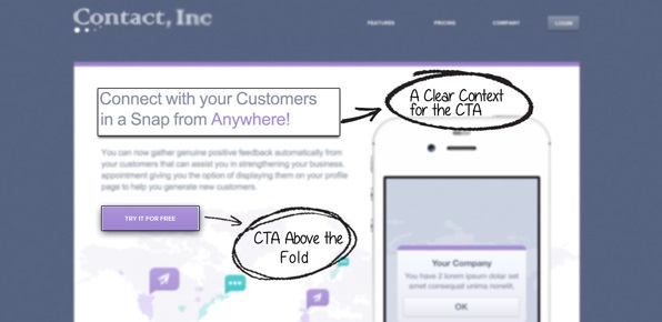
You would know the reason; I shall repeat it nonetheless. As soon as the visitor gets the information they need, you should guide them towards the next action; hence, the emphasis on ‘above the fold’. Bur remember, random pop-ups out of nowhere are a strict no-no.
2. Keep a CTA below the fold as well
Agreed that most people these days do not want to read. A casual glance and they would either sign up or bounce off. However, there are those rare ones, who would actually read through before making their decision.
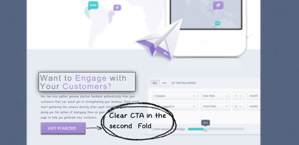
These visitors are important. They are DEFINITELY not the casual tourists; you know the ones who loaf around the internet all day (in no way am I implying that those who don’t read are not serious buyers). These readers actually took the time to know your offer, therefore give them what they deserve: an easy action, without the need to scroll back up.
Here’s an example:
3. Make it stand out
Make sure that the CTA is distinct; the simplest way to do this is to use a color contrasting to the page.
4. Let it flow, people
A CTA no matter how well designed, is not good enough if irrelevant to the context. It should become such an innate part of the landing page copy, that a CTA at the end seems obvious.
Now you would ask, “Didn’t you just say that the CTA should stand out?”
Yes, we did, and we stand by it. You have to take care that it merges with the message, while simultaneously asserting its authority over the surrounding elements. This is tough to achieve, and would come only with experience.
5. Nobody likes a liar
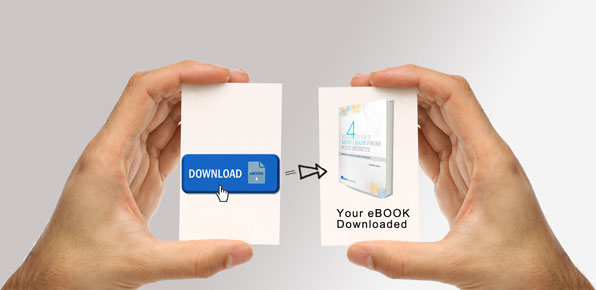
“Never promise what you cannot deliver.” So, if you are thinking of collecting the information from the visitors and then reneging, rethink. One, it is not right. Two, you would lose your credibility and will lose it bad. Promising free XYZ and providing diddlysquat, or worse a ‘Thank You For your Details’ pop-up is the way to kill it. The image below shows how to create landing page CTA in this manner:
6. Design, design
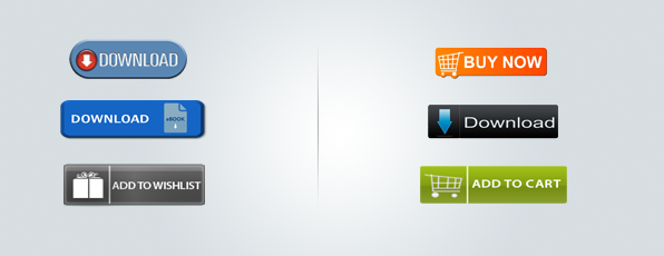
CTA design would vary, depending on what you wish to achieve. Use easily recognizable icons for the more common CTAs. One great example here is the ‘Add to cart’ cart; people recognize it from faraway.
7. One thing sums it all: Content
IMHO, choice of words is one of the most important aspects of any conversation. Therefore, on the CTA, choose the message wisely. ‘Submit’ or ‘Contact Us’ below the form are not good Calls to Action.
Wondering how to create landing page CTAs that do not sound forced? Follow this – Let the visitors know what is in it for them. While ‘Submit’ would sound like an undesired obligation, ‘Download E-book NOW’, sounds enticing, and lets the people know that an e-book is what they would gain on that click.
 | Download E-Book NOW |
 | Submit |
8. Be proactive; reassure the visitors
Your visitors have been swindled out of their information before, and like it or not, they would be skeptical. Premeditate the skepticism: words like ‘your details are safe with us’ help.
9. Secondary CTA
If your landing page is trying to hard sell something; have a bolster CTA in addition to the main one. For instance, in addition to ‘Buy NOW’, have a ‘Sign up for a FREE Trial’ button as well. This would give your visitors a chance to at least sign up for a free trial, in case they don’t want to buy the product straightaway. However, there should be a clear indication of the priority (For instance, low-priority CTA can be duller in color).

10. A/B Testing
It is very important to analyze what kind of message, positioning and design of the CTAs are working the best for you. Therefore, to really learn how to create landing page CTAs, keep testing. However, to identify the causative element of any change successfully, try to test only one element at a time.
These were our suggestions on how to create landing page CTAs optimized for conversion. If you have some ideas of your own that worked for you, please let us know.
