“People don’t want to buy a quarter-inch drill. They want a quarter-inch hole!”
– Theodore Levitt, American Economist
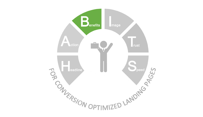
When we want to ‘convert’ our audience on a landing page, what is the most important element? ‘What is it in for me?’ OR ‘What are the benefits highlighted for the audience on the landing page?’ After all, it is all about the ‘outcome’ or the ‘benefits’, isn’t it? The third element of our HABITS framework enables the audience to see what “Benefits” they receive if they take the Action (Call to Action). Also called the “Marketing Offer” or just the “Offer”, this is the most critical piece of the landing page that drives the Action. After discussing about the 10 Commandments of Writing Headlines for Landing Page and Landing Page Call to Action Buttons that convert, here I will discuss landing pages best practices of showcasing the Benefits or the Offer.
I will tell you how you achieve the feat and why it is so important to highlight benefits: landing pages best practices.
I) Highlight the Offer in the Headline
When buying any product or service, a person’s first instinct always is, ‘What benefit will I get out of this?’ Think…why should someone be interested in your product or service? Empathize with your target audience and half your work is done! If you are providing a 20% off to people when they register, why not mention it in the headline? This way people will know whats on offer at the very first glance of the landing page.

In the above image, a 20% discount on the total sum of money can be a big deal for someone with a large family or a middle class person. Emphasizing how the offer will address a particular problem (in the above case, a discount on a travel deal) in the headline will get more leads than headlines which are vague or beat around the bush. Words like ‘free’, ‘off’, ‘discount’ etc, stir a compelling drive in people to fill in the lead capture form.
Remember: Keep your offer easy to digest and visible. You have only a second or two to capture your readers’ attention before they hit the close or back button.
II) Sell benefits, NOT features
You are browsing through the internet for an EBook on IIT and you see these landing pages:
| EBook A | EBook B |
| 150 Pages of Pure Content | Start solving algebra problems easily in the next 30 minutes |
| Images to illustrate concepts better | Video solutions: Past 32 years of JEE papers |
| Over 1000 problems that you can solve | 20 exercises that will help you revise better before exams |
| List of Algebra problems & solutions | Save a lot of time on travel |
Which book will you choose? Most of us will choose the second option, EBook B. I will tell you why? When you want to sell a product or a service, the marketing strategy that you put forth to your potential customers should always focus on the benefits of your product and NOT its features.
| A Features is – the measurable characteristics of the product which are often technical, something that most people ignore. |
| A benefit is – offering a solution to a problem that a user is facing. When you solve a problem, it appeals to the emotions of people, thereby motivating him/her to buy. |
Lets get back to our example. Why did the second book appeal to you more than the first one?
The first EBook gives features – the book has content, images and problems
The second one solves problems for a user – provides Video Solutions, a student can revise better, will save time on travel
Lets get it straight, people will not buy a product because it offers content and images (most books do that, don’ they?) OR because it is in vogue. Put yourself in their shoes. They want something which provides them a solution to their problem, a benefit that they will get by using that product/service, like mentioned in EBook 2.
If your marketing strategy is focused on the problem that a person is facing rather than focusing on its features, it will resonate strongly in the customer’s mind that you understand what they want. This in turn will trigger sale.
III) Use bullet points to highlight offers
Its human nature…we like to scan through stuff rather than read large chunks of information, don’t we? Apart from the discount that you mention in the headline, there may be many more benefits that your customers should know. Mention them in bullet points.

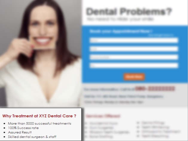
The bullet point headline in this landing page clearly state, Why Treatment at XYZ Dental Care?, i.e. what benefit will a user get when he/she books an appointment at this clinic.
1. You can see how bullet points help a reader read the benefits easily
2. They help them to consume the information without any difficulty
3. Bullet points also add to the overall presentation of the landing page
4. Write the most important points at the beginning of the text or highlight them
See what I mean?
IV) Offer should be perceived as Significant
Perceived Value/Benefit should ALWAYS be more than Perceived Cost
Let me explain Perceived Value/Benefit and Perceived Cost with this example:

Perceived Value/Benefit:
Perceived value is what a customer believes that the product is worth. They come to this perception by looking at market opinions and by the benefits that they will get out of the product if they purchase it.
In the image above, for a customer, the perceived value of the product is getting 2 Free movie tickets. The customer will not have to spend a penny to watch a film for which others will have to pay a lot of money.
Have you ever wondered why certain products cost a lot more than their counterparts (Example: Apple products)? Does using these products make them superior human beings? Not really! It is the perceived value (name and the way the products are presented) that acts as a powerful motivator for people to pay such a hefty sum for their products.
Perceived value helps you to build a chain of loyal customers. When their expectations in you fail, the perceived value fails and you loose loyal customers.
Perceived Cost:
Now, lets come to what Perceived cost means.
For a billionaire, the price of buying a plane may be less, but the same price for a millionaire may be expensive. Prices are decided by the perspective in which different people see a product. Let me make it simple for you. Lets understand it in terms of, what sacrifices a user will have to make for the product – money, time, stress etc.
Lets get to example above. The perceived cost is that a customer has to give just his email address to avail the offer. Convenience also plays a big role here. People value time more, hence when you take less time of theirs, they sacrifice less. This in turn lessens the perceived cost of the product.
When Perceived Benefit is more than Perceived Cost, the number of people who fill the form increases.
In this case, the perceived value of getting 2 free movie tickets is MORE THAN the perceived cost of providing just email id, hence the probability of form fill increases. Only by providing them their email address, they are able to get 2 free movie tickets.
V) Test, test and test!
Finally, trial and error is a powerful method to bring out the best landing page. Construct different landing pages with variations, but change only one single element in it to be able to evaluate. Changing one element at a time will help you stratergize your landing page designs better.
Now that I have discussed about highlighting benefits: landing pages best practices, let me know how helpful they were. Stay tuned to my next post on Images for landing pages.


