After redesigning its news feed, Facebook is looking to redesign Facebook Pages as well. The sharper, neater and ‘streamlined’ look, seems to have gathered fans already. The new look for Pages will continue to roll out in the coming weeks, as stated by Facebook.
“This week, we’ll begin rolling out a streamlined look for Pages on desktop that will make it easier for people to find the information they want and help Page admins find the tools they use most.”
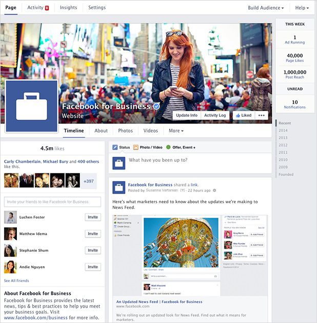
The new design, as shown in the image below (courtesy Facebook) is similar to the old version with a few but significant changes here and there. The new look was designed keeping in mind the needs of visitors as well as Page Admins.

Easy on the Eyes
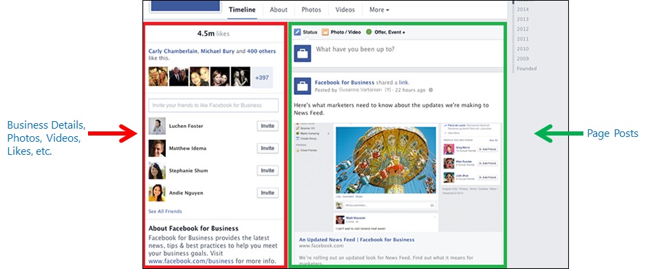
The redesigned look has two distinct sections for the different categories.
On the left side, you will find
- Information about the business (map, hours of business, contact number and website URL)
- ‘Invite Your Friends’ section
- Photos
- Videos
On the right side, you will find
- Text Box for posting
- News feed

Ease of Access to Admin Tools
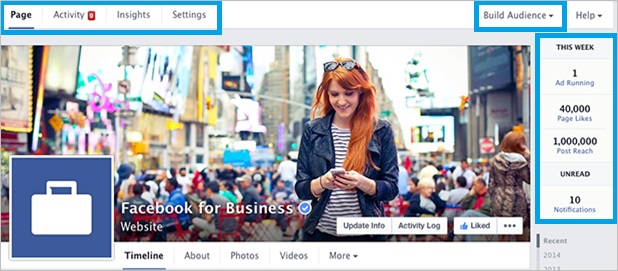
A metrics section has been incorporated on the far right-hand right side, making it easier for the Page Admin to view notifications, ads running, likes, and post reach from anywhere on the page. The top of the page has new navigation options, making it easier for Page Admins to access activities, insights and settings. The ‘Build Audience’ menu offers direct access to the Ads Manager account.

There’s more for Admins!
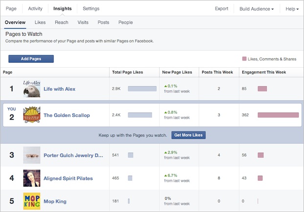
Facebook is rolling out a new feature called “Pages to Watch”, that will help Page Admins compare the performance of their Facebook Page with other similar Facebook Pages, based on metrics such as ‘Likes’. Here’s a snapshot (courtesy Facebook).

The changes for Pages on the desktop are set to roll out this week. A redesign for Pages on mobile is expected to be launched in April.


