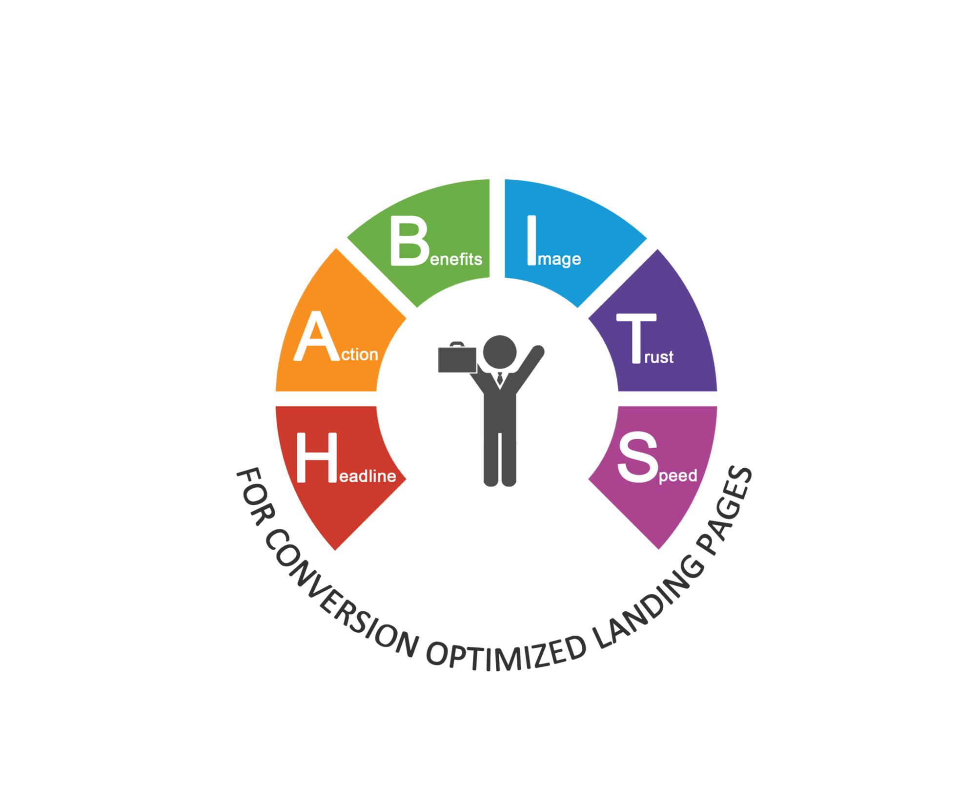
You have often heard how landing pages are at the core of all digital marketing activities. In fact, we have already written quite a lot about landing page best practices. However this time, we are breaking these “Landing Page Best Practices” down to a simpler pattern to ensure that every time you create a landing page, it is complete with the most important elements of conversion.
Learning the HABITS – 6 Ultimate Landing Page Best Practices
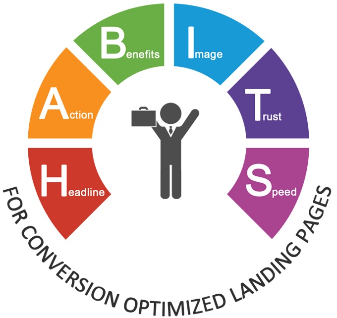
A lot of effort and experimentation goes into perfecting any skill (we all know Outliers’ 10,000 hour rule, don’t we!). Such is the case with perfecting landing pages as well. We have long experimented, made uncountable mistakes, and finally broken down the fundamentals of creating high converting landing pages into a framework called HABITS.
Stick to these habits, and you would be able to avoid the most common landing page mistakes.
1. Headline
Headline is often the first thing a visitor notices on a landing page. Therefore, you have to make it compelling enough for visitors to read on. This brings us to the first of the 6 fundamental landing page best practices, i.e. headline. It should be:
1) Short, to the point and Catchy – Research shows that a visitor would spend no more than 3 seconds on reading the headline. To hold the visitor’s attention in such a small window, you have to keep it simple, yet catchy.
2) Relevant to the Ad Message – You must maintain a message match between the landing page and the initial source that led the visitor there. For instance, if the Ad Copy talks about ‘Pink Shoes’, the headline on your landing page should not say ‘Blue Hat’. Talk about ‘Pink Shoes’ only, otherwise the message relevance would be lost, causing increased bounce rates.
Here is an example of a good message match: The ad copy says ‘Landing Page Templates’, which is reflected in the Headline as well.
3) Gives a glimpse of the offer – Let the headline make a strong case for you. The headline must highlight the offer; if you are giving away an e-book after form-fill, the headline should say that.
4) It Should stand out – The Headline should be bolder in color than the other copy on the landing page.
5) Should be ‘specific’, or better yet ‘Numeric’ – Numbers can go a long way in conveying a complex message; therefore instead of saying, ‘Video Marketing Guide for Businesses’, you can say ‘6 Steps to Create Great Video Content’.
Check out the example below. In the headline what catches your eye?
’50 Days’ and ‘100% Moneyback’ are the words that struck me the most. Not only do they convey the offer crisply, the numbers stand out amongst the words. That is the power of numbers. They make the headline direct, concrete and to-the-point.

2. Action/Call to Action
The second element of the HABITS / landing page best practices, CTA is the most important part of any landing page, because this is the very element that would drive user action. If your CTA is not compelling enough, people would not fill your form.
The CTA should:
1) Stand out – CTA is where you are calling out to your visitors to take an action; therefore, it must be visible over the other landing page elements. Use colours contrasting to your landing page background. You can even use directional cues to emphasize on the CTA.
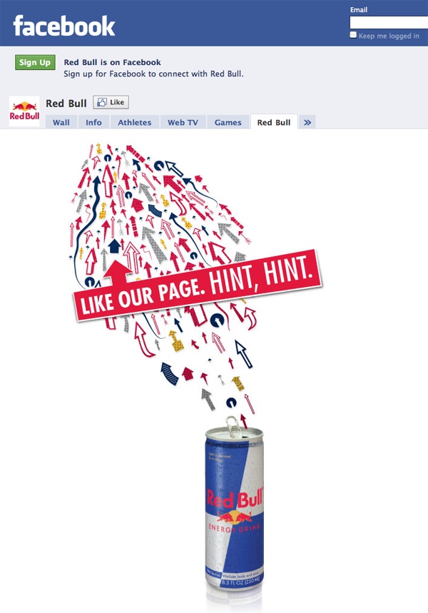
Let’s take the example of RedBull’s Facebook Landing Page. This example is from back in the day, when Facebook still allowed static landing pages. This was considered one of the best Facebook landing pages. The reason it stood out was the use of one of the most fundamental landing page best practices in a very innovative manner.
Check out their use of directional cues to point the visitors to the ‘Like’ button, which is the CTA in this case.
2) CTA should be above the fold – This is perhaps the most suggested of all the landing page best practices, and not without a reason. The action must become evident as soon as the visitor lands on the page.
3) It must be action centric, and coherent with the overall landing page message – If you want to give something for download, ‘Download NOW’ would make a better CTA than ‘Submit’. The CTA should become an innate part of the landing page.
Check out the landing page below; the CTA button is very action driven. It says ‘Request a Quote’ instead of ‘Submit’; this lets the visitor know what to expect after filling in the details.
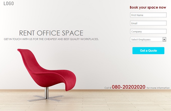
4) Phone Number as CTA – This is also a kind of CTA, and can really help; sometimes the potential customers would like directly call you, instead of filling out a tedious form.
In the example above, for ‘Renting Office Space’; you can see there is a phone number to call in addition to form-fill CTA.
3. Benefits
The ‘Benefit’ or the ‘Offer’ should always be highlighted on the landing page. This benefit would stem from the objective of your landing page.
1. Highlight the Offer in the headline – If you are giving a 30% Discount to the visitors who share their contact details with you, you must highlight that on the landing page headline.
2. Use Bullet-points to highlight the benefits in copy – Sometimes, the benefits would be more than just the 30% Discount. For instance, in case of an online education company, it can be the types of courses that are being provided at 30% off. Emphasize these using bullet points.
3. Don’t Confuse Features with Benefit – This is the golden rule of marketing, and one of the most important landing page best practices.
The visitor is not interested in what you are capable of; they want to know how they can benefit from it.
Think from the visitors’ perspective, and tell them what they would achieve after form fill. Check out these examples:
[Bad] Product is highly configurable and can be customized for any needs. (describes the features)
[Good] Increase Employee Engagement, Retention and Productivity. (describes the benefits)
4. The Perceived Value must always be greater than the Perceived Cost – Let me take an example to explain this. Look at the landing page below.
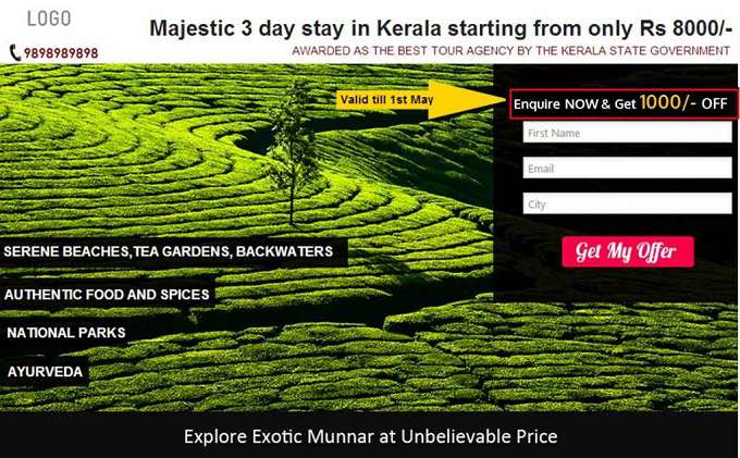
a) What is the Perceived Benefit: The main benefit is Rs. 1000/- OFF. For an average visitor, the Benefit of getting Rs. 1000/- off on a holiday package of Rs. 8000/- makes a decent enough offer.
b) What is the Perceived Cost: The visitor just have to give his/her Name, Email ID and City to claim the offer. He is not even being forced to book his package then and there. Thus the perceived cost is very less.
Whenever the Perceived Benefit > Perceived Cost, the probability of form fill increases.
4. Image/Media
Image or other supportive media elements would help engage your visitors.
1) Use Relevant Images only – A good image/video can really bring out the benefit of your offer, so use them wisely.
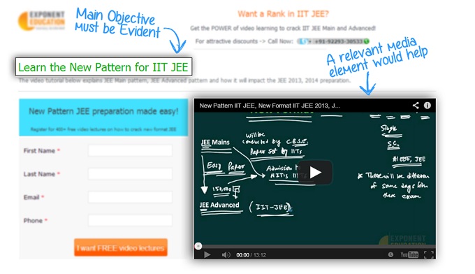
2) Relevant videos can help engage your visitors, thereby increasing the chances of form-fill. The longer the visitor is on your landing page, higher are the chances of him/her filling the form. However, make sure that the video is very relevant to the landing page objective.
Check out this example of a landing page for one of our clients. Relevant videos on the landing page really helped their conversion rates.
3) Go Easy with the Image use – Remember not to go overboard with images; too many images are a conversion killer, because they can take the focus away from your CTA, and make the page look cluttered.
4) Use White Spaces – They would give your landing page some breathing space.
5. Trust
You can go on beating your own drum for hours and hours, when one simple recommendation from a satisfied customer would do. If you are the seller, the potential buyers would take the word of 3rd parties over yours. There are a number of ways of gaining the visitor trust. You can try any of these credibility builders:
1) Customer Testimonial – Use authentic ones; possibly with a picture, designation and company of the client.
2) Customer Logos – If there are a few known brands there, nothing like it. If not, even then logos show authenticity of the companies you call your “clients”.
3) Product Reviews / Press Coverage- If my favorite Tech Digest highly recommends a tool, I would surely give it a priority over the numerous others I am planning to evaluate. This is how it normally works. You can approach well-known magazines in your domain, and request them to evaluate your product.
4) Usage Statistics / Social Proofs
5) Awards and Recognition – If there is some accolade you are proud of, display it on your landing page. However, make sure that it is relevant to the service that forms a part of the benefit.
6) Certification – Certifications from authorities (in your domain) can really help boost the trust of your visitors.
Check out the landing page below. It is for a Private Investigation firm; the certification logo and the statement ‘Trusted by Over 1200 Clients’ are the strongest elements here.
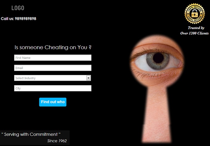
However, don’t overplay the ‘Trust’ card. Use only 1 or 2 elements listed above; not all at once.
6. Speed/Urgency
It might not necessarily make sense to incorporate this element in all your landing pages, however, wherever it would, don’t forget to include it. It is human nature to perceive whatever is exclusive, limited edition or time-bound, as high value. Work this to your advantage. Let me showcase a couple of examples where such an offer really makes a strong case:
1. [Real Estate] Registration fee waived off for first 50 bookings
2. [Airlines] Only 2 seats left!
Check out how ‘Limited Time Offer’ has been used as a action driving factor in the following Dance Class Landing Page. 50% Off for 500 early birds.
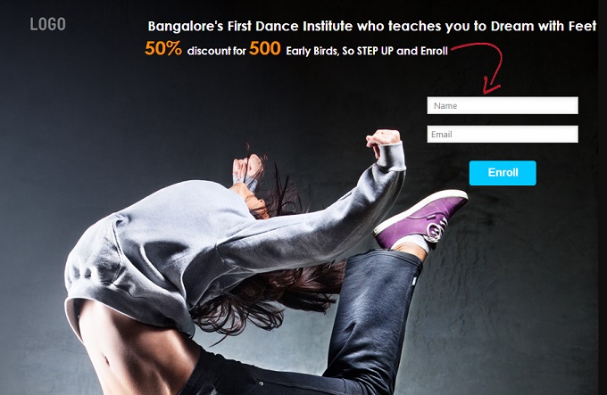
Many people would like to take advantage of such an offer, thus making Urgency the Action Driving factor here.
Now you are acquainted with the HABITS of creating conversion optimized landing pages. Tell us, how did this mnemonic device work for you; how many of these landing page best practices would you remember?
Stay tuned! We will discuss more landing page best practices in subsequent posts.
