“Either write something worth reading or do something worth writing.”
– Benjamin Franklin, Author & Scientist
Your landing page copy can either break or seal your deal…it decides whether a visitor converts into a customer or bounces off your site. Since you have just a few seconds to grab their attention, your landing page copy should not only be enticing, it should urge visitors to take the next step. It should build affinity and establish trust within their mind which will aid them to complete a desired action. Here are 13 Tactics for Compelling Landing Page Copy:
I) Align with the Primary goal of your campaign
Subscribing to your blog, requesting a price quote, selling something, free signup…what is your marketing objective? What is it that you want to accomplish through your landing page? Once you know what it is, any other line which does not fit the bill should be removed. Here is an example:

The above shown image is a landing page for a pest control website. The landing page copy is clear and to the point. The most common questions that pop into anyone’s mind are What will I get? How do I get it? Where all is it applicable (in instances of products and services). This landing page copy gives a clear picture to viewers.
Marketing objective – helping people control pests
What do I get in return – 10% off if I sign up right away (mentioned clearly above the lead capture/sign up form)
How to – Fill in your details, leave the rest to them
Where – Residential & commercial (which has been mentioned clearly in the landing page copy)
II) Get straight to the point
Cliched, yes…nonetheless valuable! Its better to be clear in what you are trying to say rather than missing the point in an attempt to be creative. In short, try and stay away from fluff. However, I am not saying that creativity should not be used and does not pay. It does, provided you have the expertise to be witty yet deliver your thought without being offensive.
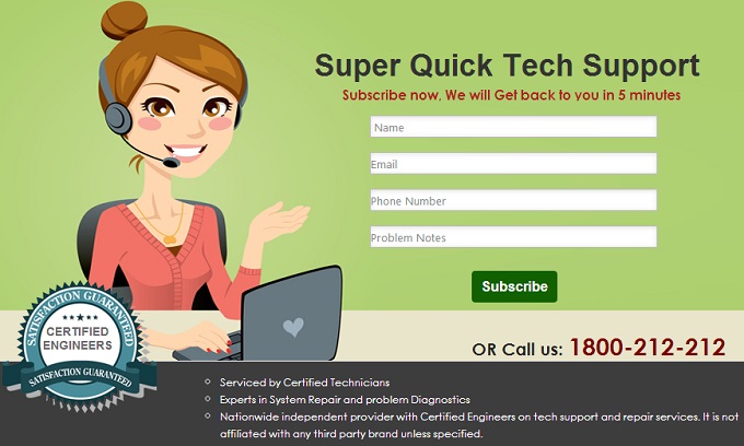
Keep your sentences short and the words simple. Complicated jargons and creative word play in landing pages can be annoying for some. Landing page copy should be simple, as easy as even a child can understand what you may be trying to convey because if you miss clarity in the landing page copy, persuading users to convert can be an uphill task.
Remember: Your final goal is conversions and not impressing them with your outstanding vocabulary.
III) Have an emotional connect with the user
Create an emotional connect with the user through your landing page copy. Use your words in such a way that they stir some emotion within the user and they visualize themselves with your product/offer.

See this landing page copy example? It plays with the emotions of happiness and feeling nice through the word ‘beauty’. There can be 2 views that a user can have on this landing page copy:
Yes, I am beautiful, I will want to use this product that will take care of me.
Yes, I am beautiful, but I don’t need anything more.
No matter which instance the user is faced with, it does ring an emotion of joy within him/her. Here is another example:
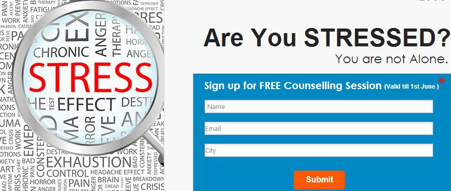
In the above-mentioned example, the landing page copy deals with the emotion of being depressed and sad through the word ‘stress’. Since this is a global predicament that most people face, they may be willing to submit their details with ease and get a solution.
IV) Sell benefits, NOT features
It’s quite easy to comprehend this isn’t it? Features TELL, but its the benefits which SELL! When a marketer sells a benefit, it educates the customer on how to combat a problem that they may be facing.
A feature is what defines your product or service. It is a characteristic that can be measured.
Example: Digital camera that has 10 megapixels.
A benefit offers value and usefulness. A benefit solves the ‘pain’ point of a customer.
Example: The feature of the above mentioned camera is 10 megapixels and the benefit is that the customer will get better photos that will capture important memories.
But again, I am not saying that mentioning features is not going to earn you bucks. There are times when you HAVE to mention the features in landing page copy. If your target audience is highly technical, appealing to their emotional side will not work well for you. They will be interested in the ‘cool’ features of the product. Lists of features also help potential customers to compare 2 products and buy the better one.
An example of this would be E-Commerce websites which sell products. A techie who wants to buy a camera will not be interested in clicking photos just to look good or ways to look better in photos with the camera…he will be interested in its features which will be Megapixels, LCD monitor, image sensor, optical zoom etc. He will also see a few more cameras, compare the features and buy the better one. I have discussed about this in another post as well.
V) Use Action Oriented language
The language that you use should be action oriented. The best way to hook your readers to what you want to say is by giving them a strong introduction…remember, you have just a couple of seconds to capture their attention.
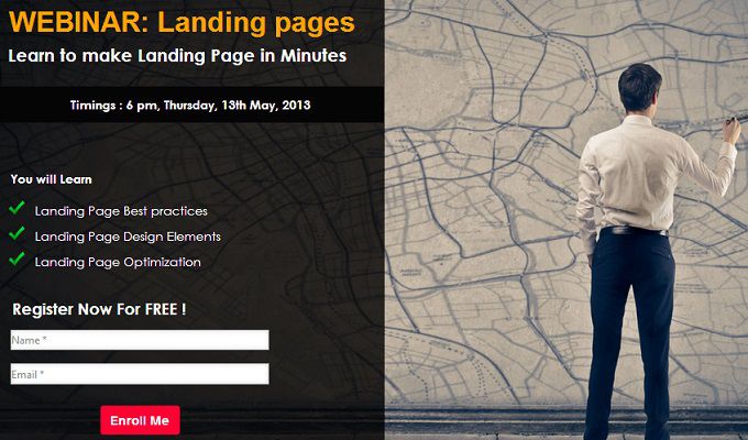
In the above mentioned examples, action words like ‘Learn to Make’, ‘You will learn’ and ‘Best practices’ inform the reader what they will get once they fill in their details in the lead capture form.
VI) Get the right keywords
Do not stuff your landing page copy with keywords in the name of good SEO. Mention the targeted keywords only in places where they make real sense naturally.
Remember: Your landing page may land in the first page of a Google search, but that’s not exactly what you want, right? The landing page copy should be able to compel readers to act on what you are offering.
VII) Write in Second person

When you write in the second person, i.e. YOU, and not it the first person, ‘I’, you are addressing the reader directly. Here is an example:
When you write to the user, you make a stronger connection with them and demonstrate your offer better. Writing in second person, helps readers visualize how the offer will be helpful to them and how they can use it.
VIII) Use bullet points, headers and line breaks
Its human nature…we like to scan through stuff rather than read large chunks of information, don’t we? Hence, landing page copy gets overlooked if it is formatted poorly and is over cluttered. This is why bullet points, headers, numbers and line breaks make things simpler.
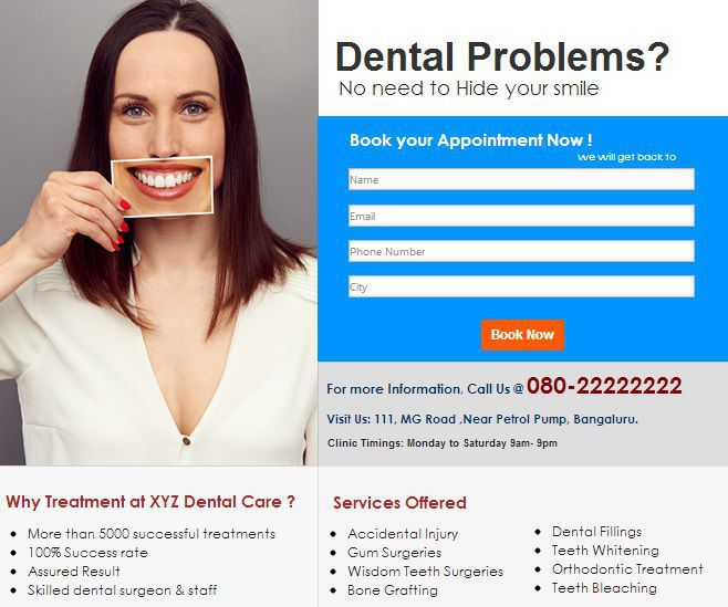
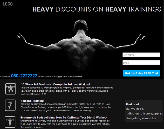
- In the image above, you can see how bullet points and highlighted sub heads help a reader read the benefits easily.
- They also help them to consume the information without any difficulty.
- Bullet points also add to the overall presentation of the landing page.
- Write the most important points at the beginning of the text or highlight them.
See how easy it is?
IX) Format your Landing Page Copy Correctly
No matter how beautiful your landing page looks, if it is too cluttered or looks haywire, it will lose its value if the reader is unable to consume the information that is being offered. Here’s how you can format your landing page properly:
- NO…
- Navigation bars & external links,
- Distracting flashy images,
- Long sentences,
- Unnecessary words,
- Lengthy Lead Capture forms
YES…Benefits only, Testimonials, ALT+text images, Maximum 5 lines, Headlines, sub-heads & bullet points
Check this example. Clear headlines, highlighted sub heads and bullet points make it easy for a reader to read through. Minimal details on the lead capture form makes it easy for users to provide their details.
X) Add Images
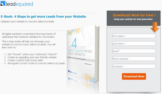
Images are an important element of the landing page copy. Product images communicate your offer a lot better than a few words.
Like you see in the image above, the landing is of providing readers a free EBook. The image of the EBook with the offer written on it gives a clear picture of the offer – 4 Steps to Get More Leads from Your Website.
So, a person who is running really short of time need not even read through the bullet points. One glance at the image and he knows what he will get.
However, if you do not have an image of the product per say, you can always add an image of the person giving the testimonial. Here are 8 ways in which Images increase landing page conversion.
XI) Add testimonials to your landing page copy
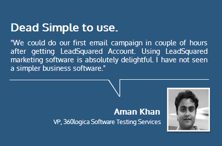
A website browser WILL BE hesitant to provide you with his/her details. Why should they? A testimonial on the Landing page acts as the ice breaker here. It gives the reader a sense of trust in you and your company/product/service. A good testimonial adds credibility to your product and makes an outsider realize that you have touched lives or business in some way or another through your product or service. See this example below.
Read this article to see why it is so important to Earn your visitors trust.
XII) Ask them for bare minimum in lead capture forms
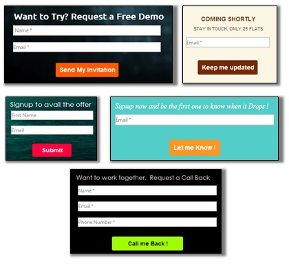
Asking too much information from visitors can annoy them and they may never get back. Plus no one will be willing to provide too much information to a stranger. Try and keep your form to a bare minimum – name, email id and in certain cases (where you need to get in touch with them personally), their phone numbers. Getting their age and address may seem like useful demographic information for marketers, but users may find it too much. Here are a few example of landing page copy where the lead capture form is asking for minimal details from users.
If you can get away without a form, do it! In such cases, for example, if you are providing an EBook for free, don’t take the contact details of the user. Instead, make sure that your details are there in each page of your EBook. It is likely that people will share your information and you will get more visitors/downloads.
XIII) A/B testing
Test which landing page copy is doing better by making one variation at a time. Like, when you want to test which lead capture form is doing better, make changes in the lead capture form only and not any other element of the landing page copy. Repeat this exercise for every element on the copy to gauge which landing page is doing best.
Now that I have discussed the tactics to get a compelling landing page copy, let me know how helpful they were by dropping me a comment.
