Designing a good landing page is no rocket science, yet the number of marketers that go wrong is overwhelming. We have had our share of goof ups; in fact, there isn’t one landing page element that we haven’t screwed up before we started blogging about landing page design best practices. :)
The key is to learn from your experience and avoid making the same mistake a second time.
Common Landing Page Design Mistakes
Listed below are 10 common mistakes you can and must avoid while creating a landing page:
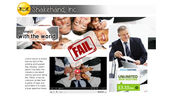
1) Cluttering the page with irrelevant media elements – Everyone loves pretty pictures, right! Wrong (at least not on a campaign landing page)! Creative elements, when used out of context can put off the visitors. Consider the following landing page; the unnecessary image use not only looks kitschy, but would confuse the visitors as well.

We had a client approach us recently, perplexed why her visually appealing landing pages did not work. Her problem was simple; the landing page had many distracting elements, which were not relevant to her campaign. So, we asked her to get rid of the unnecessary videos and images, and as expected, there was a significant improvement in the landing page’s conversion rate.
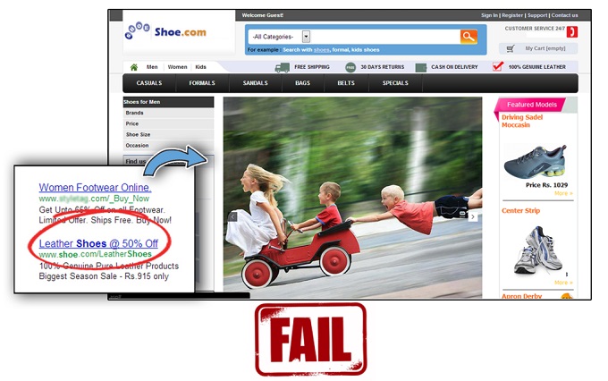
2) Landing your visitors on your website homepage – If there was a recipe for landing page disaster, this would be its main ingredient. If your paid campaign has a focus (and it should always have one) , the landing page must be focused too. The Ad Campaign below is an example of this classic rookie mistake.

I am assuming you have more sense than money, and most ad campaigns are Cost-Per-Click. When you are paying Google (or anyone else for that matter) for every visitor that clicks through to your landing page, why would you not collect their most basic details, before they navigates away. Therefore, create customized landing pages for each campaign.
3) Poor message match – Let us assume you wish to run a new ad campaign, but you do not have the time to create a new landing page. Therefore, you link the new campaign to the landing page you had created last month for the ‘Year End Sale’.
But wait; there is something wrong with that plan: Yes, it is not year-end anymore. So, shortage of time/resources is not an excuse. You have to make sure that the main message is evident as soon as the visitor clicks through to your landing page.
4) Using too many colours to attract attention – Avoid a colour riot, unless you wish to scare your visitors off. Contrary to what you might think, they do not make the landing pages more appealing. Gaudy colour use would do nothing but harm your credibility. Instead, use 2, or at the most 3 colours, consistent with your website theme.

5) Using a generic headline – It is important to have a prominent headline on the landing page, consistent with the message of the ad copy. Generic Headlines for all your Landing Pages is never a good idea.
6) Giving the user too many options – Focus the user action to one simple thing, and you will have a better chance of prompting visitor action, than if you give them multiple options. If he needed multiple options, he would not have clicked on your focused ad campaign.
For instance, the following landing page has 3 CTAs: E-Book Download, Free Domain Name, and Unlimited Web Hosting. We can now safely say that Shakehand, Inc. will lose 60% of the prospects that would otherwise have converted to leads.

7) No vouchers of your credibility – This specially stands, when you are new to the business. People do not know you; therefore, give them a reason to trust your brand. Ask your satisfied customers to write testimonials. Nothing works better than an authentic customer testimonial when it comes to gaining potential customers’ trust.
8) Keeping the navigation bar – This is as good at landing the visitor on your website homepage. So, steer clear of it.
9) Too many form fields – Let’s be realistic here, the visitor hardly knows you. Why would he/she then trust you with multiple pages of information? Keep the form fields relevant. If only newsletter signups is what you are aiming at, Name and Email ID are enough.
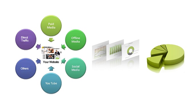
10) Not tracking the landing page performance – Never mind its position in this article, this is without a doubt the worst landing page mistake a marketer can make. Without knowing the conversion rates of landing pages, you cannot figure out which landing page is working and which is not.

Therefore, not only will the non performing landing pages feed on your resources that could have been utilized elsewhere, the mistakes will be repeated once again, and repetition of mistakes is what we were trying to avoid right!
Alright marketers, over to you again. Tell us how many of these mistakes you are already guilty of committing.


