(Disclaimer: These are the findings from our previous webinar series. Get a copy of latest landing page design hacks here.)
It was a webinar week again, and Shibani was once again caught up with planning it. She had the speakers ready, the timeline in place, and had the email campaign inviting registrations – all set up.
There was only one thing left to do – increase conversions. That is, boost the number of sign-ups for the webinar.
Currently, she was averaging a 49.72% conversion rate (of the previous 4 webinars). While this is actually not a bad number, for a webinar it needs to be better. Because all those who sign up do not end up attending it. In our case, we see that less than 50% of those who sign up actually end up attending. So if 50 people sign up, then less than 25 turn up.
Less than 50% of those who sign up for a webinar actually attend it.
Before you think, “then, email more people,” let me tell you something. Shibani does not believe in spamming people. She ensures that her emails reach only those who have opted for it, and if someone had unsubscribed, they do not get the webinar email. So the question that she was musing on is actually this: “how to increase the webinar sign-ups with the existing lead list?“
If you have been a regular here, you would know that targeted email marketing already got her open and click rates to shoot-up. So people are definitely reading the email and coming to the landing page. Now, the challenge was to figure out how to get those people to actually sign-up for it.
Challenge accepted.
Landing page design experiment #1
The obvious answer was to experiment with the landing page design. The existing landing page that she used looked like this:
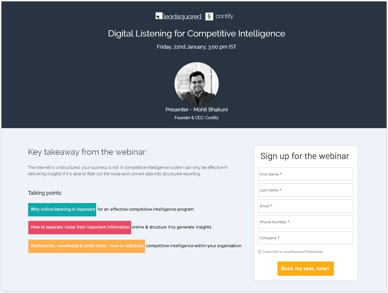
Let us see why this page performs so well:
- Clear Message
- Content above the fold line
- Good form heading
- Autofill options
- Relevant CTA
So she decided to change the look and feel of the landing page, while keeping the overall layout quite similar. Taking her concern to Rajat, they discussed for a while and came up with this new layout:
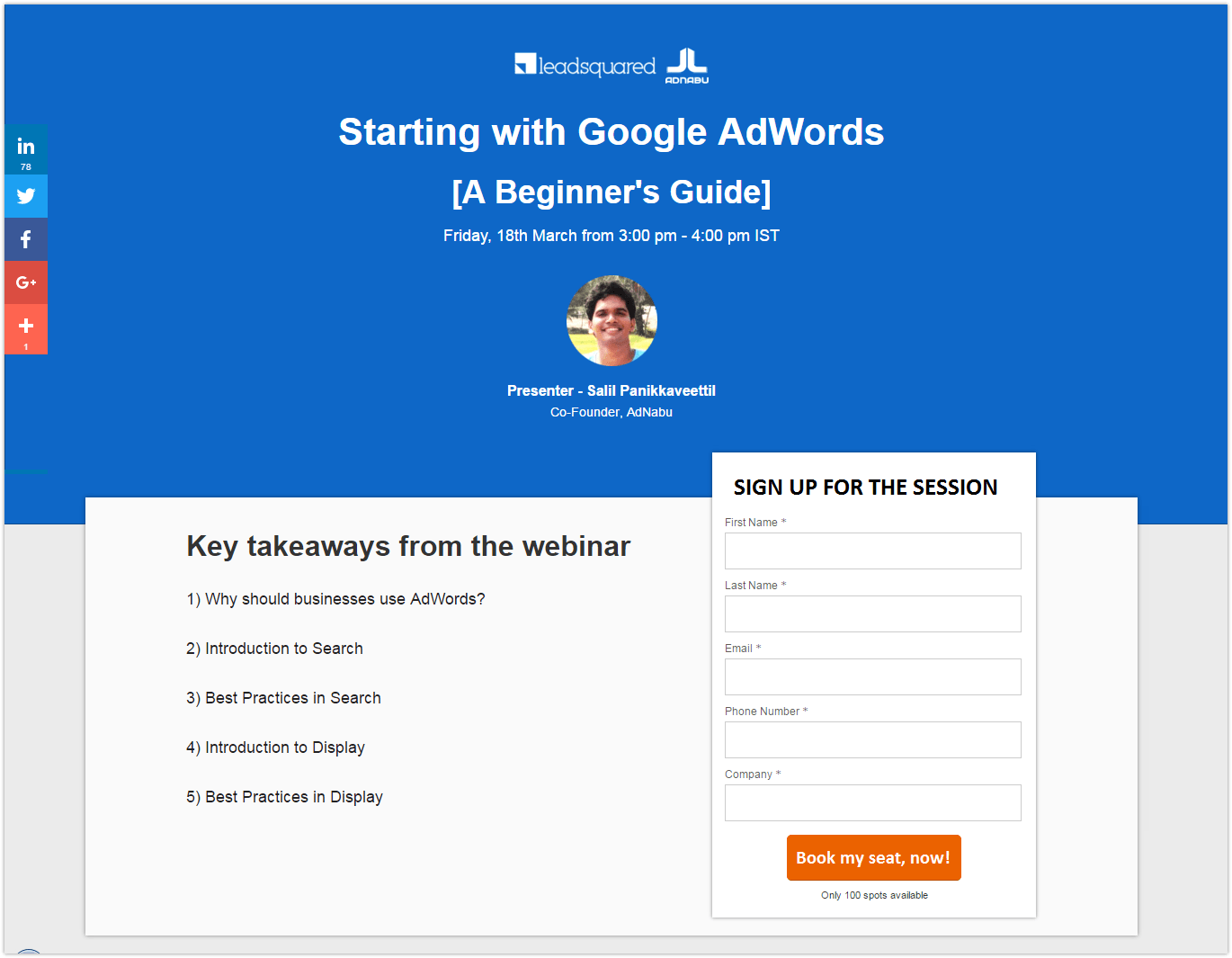
Can you guess the conversion rate for this one? A whopping 60.2%!!!
Let us see why –
1. Change in look and feel
A large part of our subscribers have been with us for a long time. We send out webinar emails to them every two weeks. So seeing the same landing page every time did not capture their interest. However, once the look and feel of the landing page changed, it attracted their attention and encouraged them to sign up.
2. Brighter color makes it more compelling
This is basic color theory 101. While the “best color” for the conversion is largely debated (some insisting that it could depend on personal experiences), the more attractive color generally gets more attention. In our case, the bright blue captured the user’s attention and thus resulted in more sign-ups.
3. Lesser distraction from the CTA
To explain this aspect, let me tell you about the Von Restorff effect. Popularly called the “isolation effect,” it predicts that an item that is different, that sticks out, is the one that gets remembered. For marketers like us, that means if the CTA stands out, it has higher chances of getting clicked.
In the previous landing page, the key takeaways were highlighted – each with a different color.
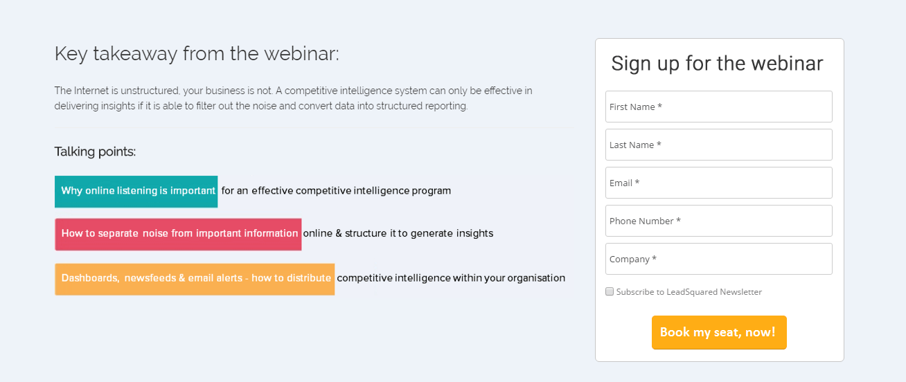
Our objective for doing that was to grab the attention of the audience with what they could learn from the webinar. Using the “what is in it for them” approach, we tried to attract leads by showing them the benefits of attending.
Grabbing user attention is cool. But it should be the right kind of attention. In our case, it worked against us because we grabbed the user attention away from the CTA! A critical mistake we realized only after seeing the conversions on the later page.
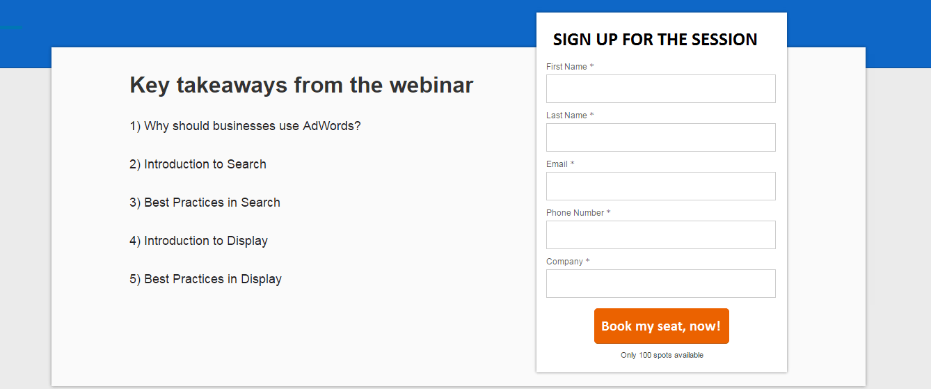
On this page, the first thing you notice is the CTA – an attention grabber that definitely contributed to the higher conversions!
4. The phrase below CTA – “Only 100 spots available”
This phrase is a major contributor to the conversion spike. It effortlessly conveys a sense of urgency to the users to sign up immediately. Nobody would want to be denied access!
Also, it conveys certain exclusivity to the 100 who do participate. Being part of a select class to learn things that is restricted to others was a good motivating factor to sign up.
All in all, this landing page definitely got more conversions than the previous one!
By changing the look and feel, using bright colors, eliminating distractions from CTA, and creating exclusivity, conversions on landing page increased by 39.17%.
However, her experiments did not end there. If it was fair to assume that the layout worked, will it matter if one more thing in it changed?
For e.g., can altering the bright color of the form result in conversion increase?
The only way to find out was by actually testing it out.
Landing page design experiment #2
So, for this webinar, Shibani changed the bright blue to bold orange, leaving the remaining elements intact. And the best part? She A/B tested it. So one half of the email list viewed the orange landing page, while the other half saw the blue landing page.
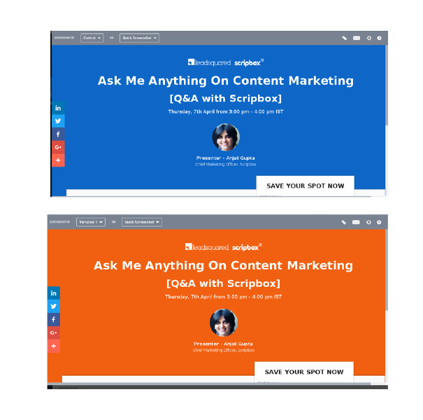
Which one do you think won?
The orange one did. Hands down. The conversion on the orange landing page was higher by a solid 8%, when compared to the blue – a clear winner!
Let us explore why that could be:
1. We are extremely used to a blue interface
Facebook is blue, LinkedIn is blue, Skype is blue, why, the UI for LeadSquared is also blue. So perhaps, it did not make an impact as orange did, which unlike blue is not a common color.
2. Better overall appeal
There is also the possibility that orange seems more appealing to the audience – more pleasing, interesting, and exciting that blue did not quite achieve. Which also resulted in higher conversions. It is the color theory all over again – orange is a lot more fun and prompts the user to take action, while blue is a bit passive.
Use of pleasing, interesting, and exciting colors can increase landing page conversion rates by 8%.
Regardless, Shibani achieved the goal she started with – increase her conversion percentage by changing the landing page designs. Would she be happy with her current rates and stop experimenting? Definitely not. This is just the tip of the ice-berg.
She is bound to try something else, which will again impact our conversion rates. And when she does, I shall let you know.
Till then, it’s your turn. What experiments have you conducted with landing pages? Have they all yielded positive results? Do let us know!
