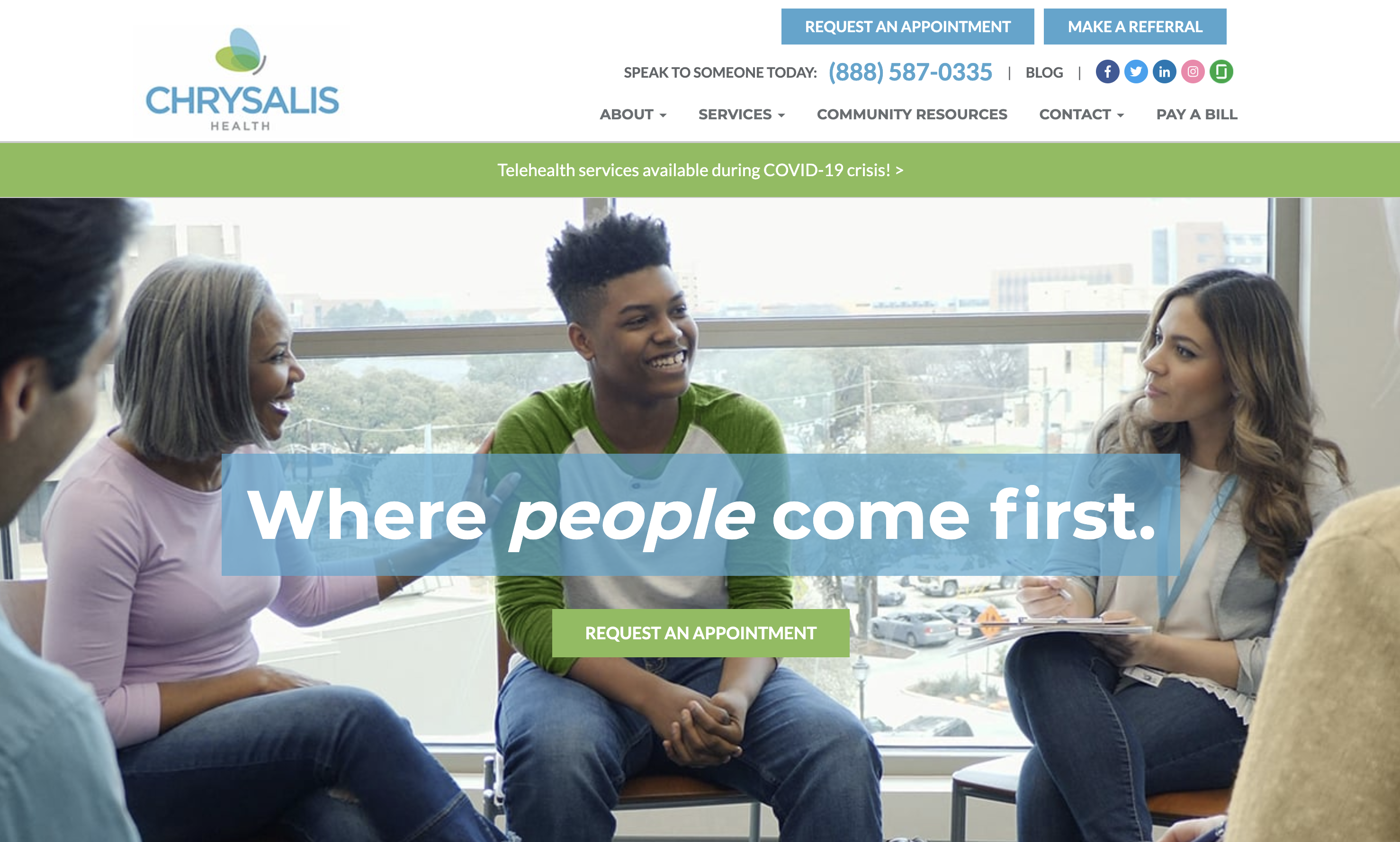
Your telehealth website is your digital home.
And, as with any real-life residence, your website behaves as a social and cultural touchstone.
The chief messenger of who you are and what you do.
An integral part of your branding.
The virtual “welcome mat” you roll out for all your patients and users.
Translation?
A dull, disorganized, or mismanaged site can yield fewer visitors at your virtual “door,” and can ultimately hinder the growth of your practice.
Let’s consider some stats:
- A user can determine whether they “like” your website in just 5/100ths of a second.
- 38% of consumer surfers will leave a website if they find the layout “unattractive,” while 88% consider themselves “less likely” to revisit a website after a subpar experience.
- Between 40 and 60% of surveyed consumers are looking for expanded virtual health solutions such as 360° digital “front door” services that facilitate a seamless, point-to-point patient journey.
These findings suggest a website on its own just won’t cut it: it has to be engaging enough to compel users to stay. (Which makes sense: Why would anyone trust you with their wellbeing if they can’t trust you to run a beautiful, optimally functioning site?)
A website on its own doesn’t cut it: it has to be engaging enough to compel users to stay.
Plus, there’s the practical element.
A website can also serve as the primary tool for supporting crucial telehealth components, including (but not limited to):
- Appointment and prescription management
- Electronic health record (EHR) access and updates
- Paperwork/consent form filing
- Email Q&A with doctors, nurse practitioners, pharmacists, etc.
Ultimately, a website is fundamental to your telehealth program as well as your efforts to build an audience.
But what makes a telehealth website? And, more importantly, what makes a telehealth website great?
1. UX
Admittedly, “user experience” (UX) is a fairly broad term, encompassing a wide range of website functionality.
That said, it’s also the point from which all website success ebbs and flows—and the underlying premise upon which your entire site will be judged.
As a result, there’s no shortage of things to think about when crafting a captivating interface. The non-negotiables are:
A welcoming design

Not that your website needs to generate a warm and fuzzy feeling per se, but it does need a sleek, responsive design that’s easy on the eyes (and brain). With most users making split-second decisions on whether they want to engage with a site at all, your webpages should be instantly alluring and should entice users to get clicking as soon as possible.
Some ideas on how to do this include:
- Be mindful of negative vs. positive space (an intricate balance of both is helpful).
- Use videos and images to enhance visual stimulation.
- Choose your color palette carefully. Different pigments can send different messages.
- Be consistent when it comes to logos, grammar, spacing, etc.
An approachable interface
Run a quick search for “UX best practices” and you’ll undoubtedly come across words like “seamless,” “intuitive,” and “accessible.”
Allow me to synthesize:
Your webpages should be sensitive to users and easy to navigate––putting all applicable information on full display.

Ways to streamline interface interaction include:
- Implement plans for mobile optimization to make your site cleanly readable––and easily navigable––on personal tablets and phones. (85% of Americans already own a smartphone, so odds are someone will try to access your site on a small screen.)
- Cut out the middleman wherever you can. Investigate asynchronous tools such as digital intake forms, screening surveys, or bot-powered Q&As. These can save patients and staff extra time and energy ahead of telehealth appointments.
- Integrate whenever possible. Your website should play well with other solutions like point-of-sale software, patient databases, or office calendars. Make sure your web developers can incorporate these types of services into your overall site design.
Definitive calls to action
You’ve successfully attracted a user to your telehealth website. Well done!
Now the real work begins.
Once someone arrives at your site, they’ll be looking for a clear sign as to what to do next.
Avoid customers getting lost in the digital wilderness by asking yourself about ideal next steps in your consumers’ journey. After a visitor has landed on your site, are you hoping they’ll sign up for your newsletter? Watch a YouTube video about your award-winning staff? Schedule a telehealth consultation?
Whatever you decide, be sure to leave obvious breadcrumbs for your user and lead them directly to the finish line. Create unmissable calls to action (CTAs) so visitors will know exactly how to proceed. (Think: “Sign up for blog alerts here” or“Get in touch via the form below.”)

2. Compliance
You deal in healthcare, so you know the drill.
Any processes involving personal/protected health information (PHI) fall under the jurisdiction of federal laws governing health record liability and security.
Your website is no different.
Any site you build should feature applications that are 100% compliant with legal standards. Bear in mind these standards can (and will) change over time, so part of your job will be to stay up to date on any legislative developments.
As of 2021, proper website procedures require compliance with (among others):
- The Healthcare Insurance Portability and Accountability Act (HIPAA), effective as of 2003, which includes guidelines for patient data confidentiality.
- The Health Information Technology for Economic and Clinical Health Act (HITECH) of 2009, which puts teeth in HIPAA’s privacy laws, further extending them to electronic data.
- Centers for Medicare & Medicaid Services (CMS) criteria for EHR.
When constructing your telehealth website, be sure developers are aware of these requirements and know how to execute them appropriately. If you’re planning on outsourcing your web development, ask your provider about compliance features such as data anonymization and encryption services before proceeding (veteran telehealth web designers like Cardinal and Topflight will ensure these functions come standard).
3. Content
A full calendar of well-written, informative, and meticulously researched content is a necessary cog in your website machinery.
In fact, content is an indispensable piece of your overall inbound marketing strategy: a practice that relies on substantive, educational materials to bring curious consumers to you, rather than trying to force the issue by deploying less palatable, “in-your-face” advertising. [More on inbound marketing in our next installment.]
A full calendar of well-written, informative, meticulously researched content is a necessary cog in your website machinery.
Start thinking about how your practice can best offer genuine insight and actionable advice to patients and providers who have lingering questions about telehealth.
Some examples:
- A weekly blog highlighting up-and-coming telehealth industry techniques and devices (there’s evidence such articles can pack a bigger punch than normal ads)
- A video series hosted by in-house specialists to address patient FAQs
- A podcast featuring interviews with nurses, technicians and other staff.

Whichever type of content you choose (and you can choose several), remember the point is to demonstrate credibility in your field and to provide website visitors with impactful information they probably won’t find anywhere else.
Such content programming results in a win-win for everyone concerned:
- Patients and providers get real-world guidance surrounding telehealth practices and the latest in telemedical news, while at the same time…
- Your marketing team establishes your website as a go-to authority, drawing potential customers into your orbit and––by extension––exposing them to the many advantages of your service.
Put in more traditional marketing terms: Your content marketing efforts help push prospective clients further down the “sales funnel,” coaxing them from the proverbial “awareness” stage to “consideration.”
But keep in mind: It’s likely you’ll need an extra team (or teams) to help you with all this content output.
Depending on your budget and chosen media, it might be a good idea to begin researching potential candidates for blog writers, videographers, and/or graphic designers to help round out your content lineup.
Keep in mind too: You’ll also need at least one teammate who’s well versed in search engine optimization (SEO) practices.
This team member should advise on trending industry web searches (to generate ideas for future content); optimal keywords usage (to appeal to target users); and best-practice formatting, all of which can help boost your web rankings. These SEO hallmarks are critical to website operations, if only because SEO has the power to increase your traffic by a factor of 10 (over organic social media posts).
Bottom line: SEO brings more eyes to your site. And more eyes mean more chances to expand your telehealth practice.
4. Metrics
Traffic volume and traffic quality aren’t the same thing.
Website performance metrics are essential for understanding what you’re doing right, what you’re doing wrong, and what you should do going forward to capture the hearts of your most sought-after patients and users.
As such, your web strategy should always embed mechanisms for tracing key engagement markers such as:
- Scroll depth
How far a visitor makes it through a specific page on your site.
- Bounce rate
The share of visitors who “bounce” back to Google after spending only a small amount of time on your site.
- Downloads
The number of people who downloaded a piece of gated material you provided.
- Views
The number of times someone watched your video(s).
- Appointments made
The number of visitors who chose to sign up for a telehealth session via your site.
Such data can provide a much-needed heads up on how well your website is retaining audience attention.
It can also help inform your next moves.
Notice a lot of visitors aren’t moving past your homepage? Maybe think about reconfiguring the design. Got a blog post no one’s reading? Delete it and avoid posting any similar subject matter for a while.
Let your metrics be the strongest driver of content edits, updates, or changes.
Last but most assuredly not least, metric analysis is a must because it can guide you through your overarching inbound marketing plan: your top-to-bottom program for bringing new patients and adopters to your doorstep (as opposed to the other way around).
Which, as you’ve probably guessed, involves a lot more than just a website.
Note…
Yes, we have a telehealth series going here. Next up: an in-depth discussion of inbound strategy… and why your telehealth practice won’t get far without one.
This is the second of a 5-part series. You can read the others here:


