How do you ensure the changes you make to your website produce positive results?

Meet Joy McClure from Tricoci University. She’s the school’s chief admissions officer—and she knows how to make effective decisions about digital marketing.
Her secret is testing, that is, what’s commonly called split testing or A/B testing. It’s a simple concept where you test two versions of something against each other.
A/B testing is a method of comparing two versions of a webpage or app (or any tactic) against each other to determine which one performs better for a given conversion goal.
Optimizely
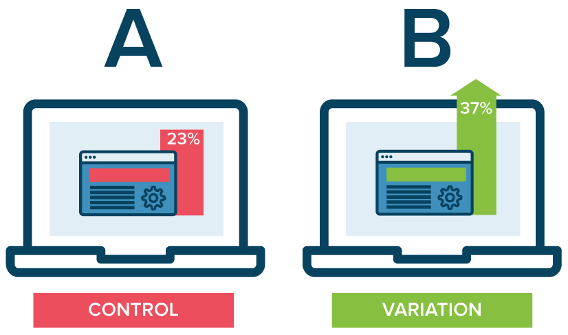
Optimizely goes on to explain A/B testing:
- Enables you to ask focused questions about changes to your website or app and then collect data about the impact of that change.
- Takes the guesswork out of website optimization and enables data-informed decisions that shift business conversations from “we think” to “we know.”
I asked Joy a series of questions about her approach to testing. Here are the highlights…
Q: What do you test?
Joy: It could be program pages, the photos we use, the buttons at the top of the page, how much info we ask for on a lead form, whether we do or don’t use chat. Really, we A/B test almost every decision we make.
Q: What might you test on a program page?
Joy: We know that consumer behavior is different for a cosmetology student versus an esthetic student. (The full name of the school is Tricoci University of Beauty Culture and it has many campuses across Illinois, Indiana, and Wisconsin).
We know if somebody came to us through a paid channel versus an organic channel, their behavior is different, so when we test different components, we really want to identify it to that granular of a level. It allows us to provide customized messaging based on behaviors that will hopefully lower the bounce rate, improve engagement, and our click-through rate.
Q: Do you test email?
Joy: We don’t do a lot with email. We target 18 to 24-year-olds, so we test text messaging.
For text messaging, we’ll test the subject and the subject line, the length… everything is tested.
We’ve learned real directive language is more effective—something that will require an engaging response back versus “yes,” “no,” or “stop.” Length really does matter and more commanding statements tend to work.
Q: You said you even test photos?
Joy: Absolutely. When I first joined the organization we had real high-end photos, high fashion photos. They looked amazing and everyone who worked for Tricoci loved them.
After we tested them, we didn’t find they were effective as some photos where students are smiling and it looks like a more approachable program. So again, it doesn’t matter whether we like it; it comes down to performance.
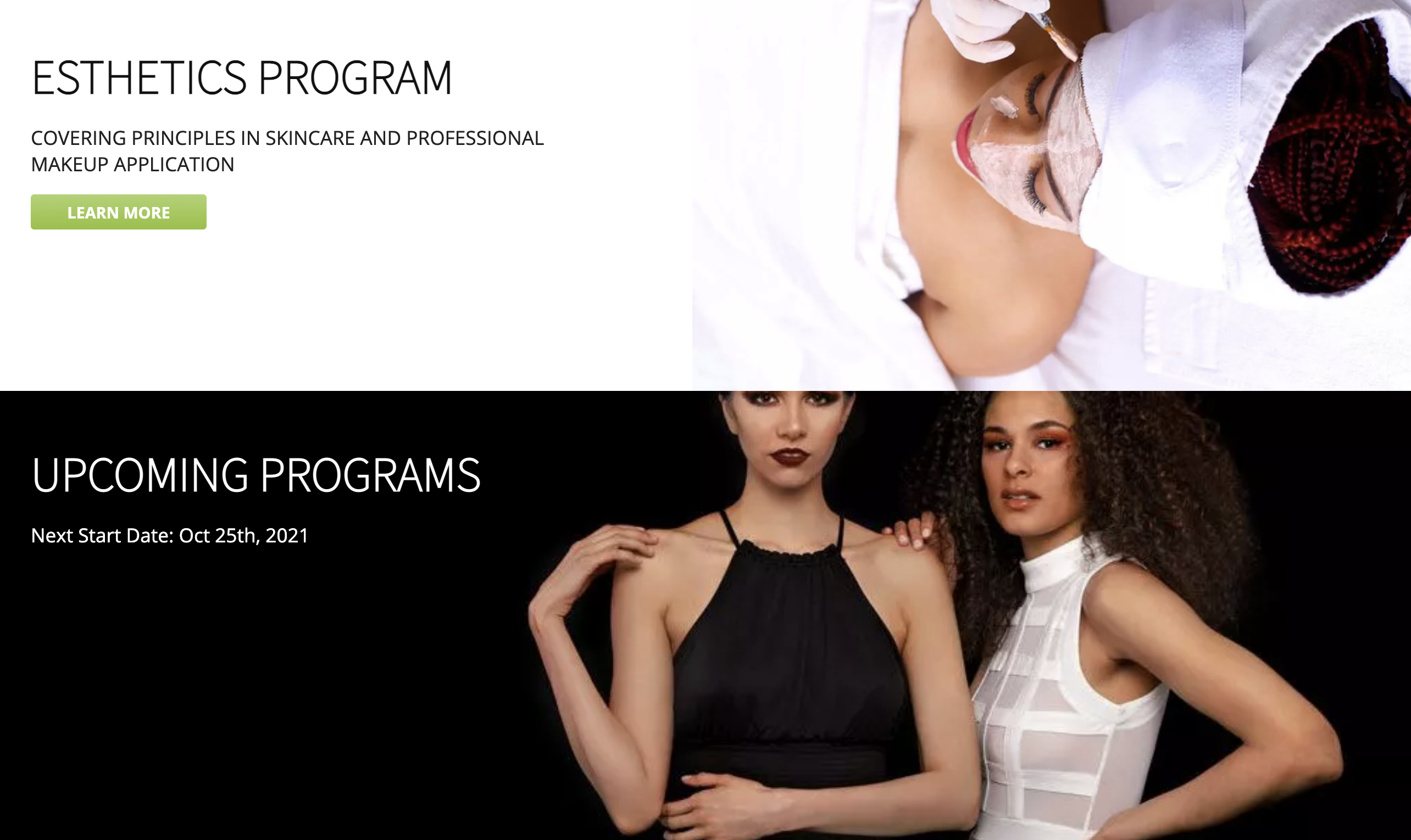
We swap out photos all the time, even the placement of the photos… Are they smiling? Or are they not smiling? All sorts of factors are tested to see what is the most effective.
(Author’s note: authenticity wins.)
Q: You talked about testing the site’s navigation too?
Joy: Yes. So what we have in the tab (navigation), and even the order they’re in has been tested.
Does it work to have a green background behind “Apply Now?” Is it helpful to have the next class start listed?

All of those types of features have been tested. And we also know what works today could change as recently or as soon as in 90 days, so we’re constantly re-testing as well. We’ll test it on mobile versus desktop because we know they produce different behaviors.
Q: What kind of testing do you do on your site’s forms?
Joy: Basically, what fields are required. If we’re asking too much, they’re less likely to fill it out. They’ll bounce off the form. What do we need down-funnel for it to be successful and capture enough information? It’s a bit of a balancing act. What’s too much? What’s just right? And how easy is it to fill out? Is it dropdown?
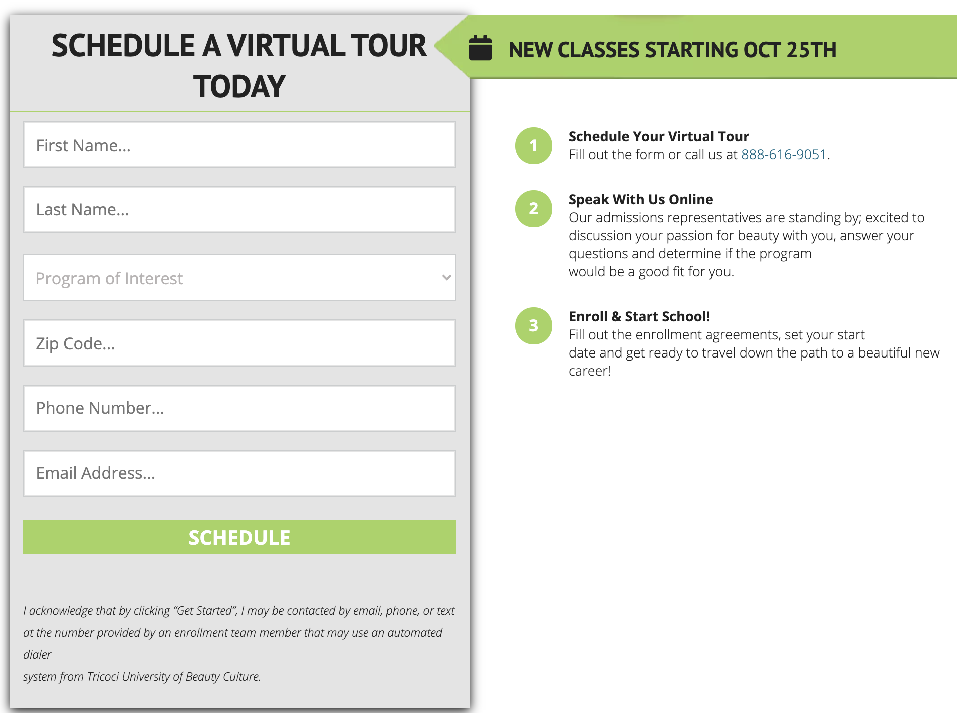
Q: How do you test your messaging?
Joy: We’re testing headlines, subheads, and what we’re writing about.
What’s bolded? What do we list below it?
And again, we know the behaviors are different based on the program… how they found us… whether they came in through a lead channel that was paid or they came in through organic… We really wanna try to customize that messaging as much as possible.
We also look at the words we’re using. If they’re keywords, will they improve our rankings? All of it is tested and assessed as well.
Q: Besides testing these things in the form factors you use, largely webpages, you slice and dice data by location?
Joy: Yeah, absolutely. We have schools that span multiple states. We have some in suburban markets, some are in urban markets. Those consumers are very different, so we really want to make sure we’re assessing it by location so we can really serve the right message to the right audience.
By analyzing this data, we’re able to make a level of customization to hopefully trigger stronger results. And we have found great success being this granular.
Q: What about pay-per-click campaigns?
Joy: Pay-per-click is probably our second-largest lead channel. It’s incredibly important to us and one of our higher converting lead channels. So we really want to make sure our rankings are up, we’re blogging the right things, our keywords are working, and that the backlinks are becoming effective for us.
Q: Are you personalizing your content?
Joy: Yes, as much as we can. For example, in the beauty industry space, we have students who are interested in esthetics. They are much more like a pre-med student. They’re gonna’ do their due diligence. They’re very methodical, not impulsive.
Then on the other side, we have cosmetology students, which are much more creative types. They respond to images more than facts. We look at it through those types of lenses. And then if we know the audience varies— whether it’s suburban or urban—our images could change. So it could be the images, and it could be the written content.
Q: You spoke about testing chatbots. So you not only test design decisions, but you test tactics too?
Joy: Yeah, we tested whether we should have a pop-up window announcing we were doing interviews remotely during COVID. We tested chat and found it to be effective in some cases and not effective in others.
Q: I believe you mentioned testing whether or not to publish your tuition fees?
Joy: Yeah and we found it creates trust. It creates a longer experience on our website. The bounce rates go down. So we do publish ours.
Q: Are you testing anything right now?
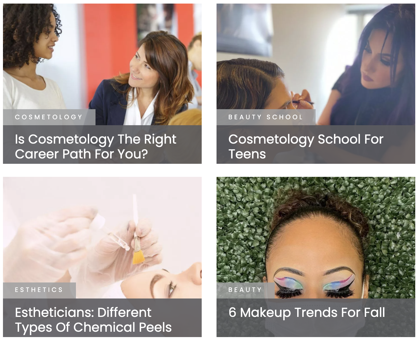
Joy: One of the tests we just completed was whether we wanted to have the beauty blogs on the top as one of the items.
We take a lot of pride in our blog. And we have found this to be very effective. But we didn’t use to have it up there, so this is one of the changes we made recently.
We have six or seven tests going on right now. Location page is one of them, program page tests, moving the Download Tricoci Guide section further up the page is being tested.
So if you were on a program page, we have a Tricoci guide, so if you go to esthetics, for example, and then you should be able to find the guide. So if you go down, we must have the guide further down, and we’re looking to see if we should move the guide up.
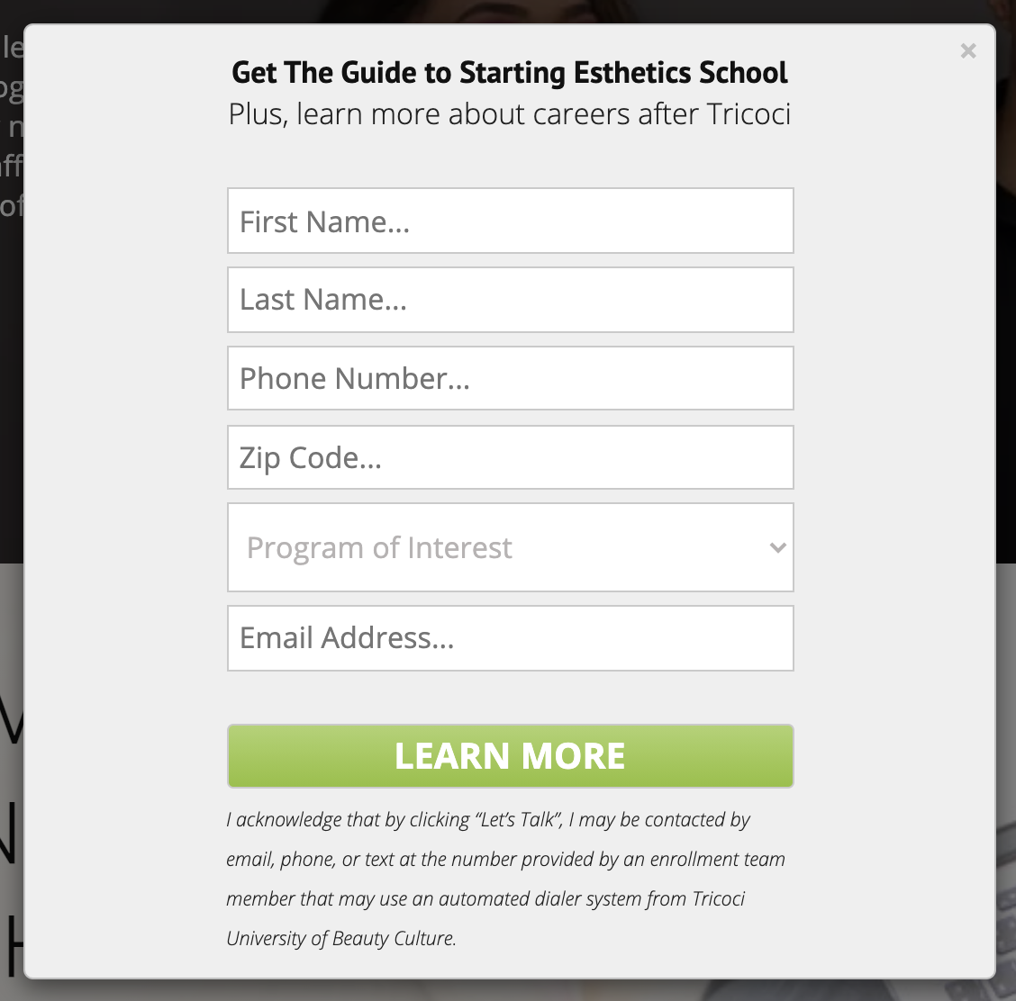
The guide was moved up—in the form of a pop-up.
(Yes, Tricoci University is making smart, data-driven decisions.)


