You must receive several emails a day. But do you open all of them? Do you take the desired action? That’s the tricky part – to get the reader to take the action you want him or her to take. It’s not only important to see that your email gets delivered to the inbox and gets opened, but to also have the right ingredients in the email, to get the reader to take the desired action. In this chapter, I have tried to explain the same.
Here are five action-centric emails marketing examples:
Fitbit
Fitbit is a health and fitness product company.
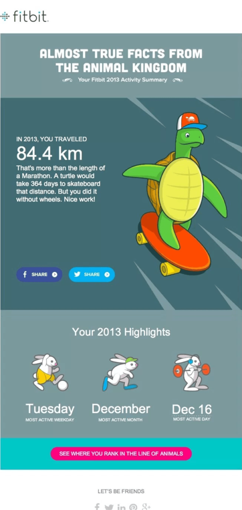
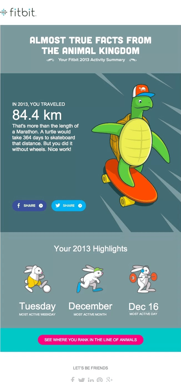
This email is all about the recipient. These elements entice people the most. It’s also a great example of app promotion via email. The email encourages the reader (customer) to use the app. And that might actually work out in case they want to beat this number in the next year.
Why is this on my list?
- Animal pictures – One of the first things I see at a glace are the interactive images. The animals in the email stand out almost immediately and that instantly tells me that this is a lighthearted email that might be fun to read.
- Numbers – The use of numbers in the email really work for me, especially 84.4km. Now someone who has been using the product will automatically be interested in that specific number. This generates interest or curiosity, whatever you may call it.
- Contrasting CTA – The pink CTA stands out primarily because of the colour. It’s completely different from the background colours, making it very noticeabale.
- The word ‘You’ – Notice the number of times the words ‘you’ and ‘yours’ are used. This clearly indicates that the mail concentrates on the individual receiving the email.
Eat24
Eat24 is a food delivery app.
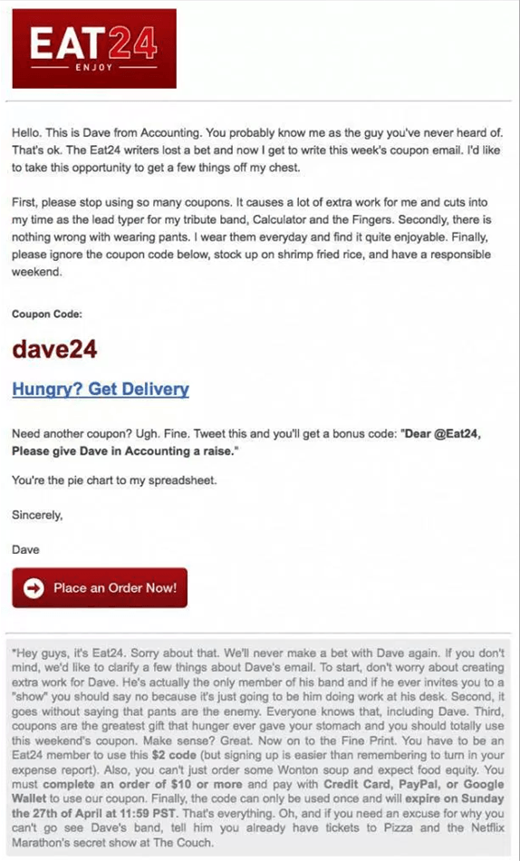
Eat24 emails are best known for their funny, relatable and witty style of content. They keep it simple and casual, making the language easy to understand. Remember they are a food delivery app. So their audience would vary greatly. Keeping it really simple is the key.
Why is this on my list?
- Deliberate use of different font sizes – The font size of everything that is important to the business is bigger than the rest of the text in the email. Notice the big logo (great for brand recall), the coupon code (which they are trying to sell) and the CTA (conversion button) are all much bigger than the rest of the content in the email, clearly showing what they want readers to notice first.
- Prominent coupon code – Now the point of this email is to use the coupon code to place an order. The coupon code is highly prominent, making it easier for the reader to use it or share it. In other words, the reader doesn’t have to hunt for it in the email.
- Sense of humor – Their copy is so good that people even read the fine print.
- Branding – Their logo is very noticeable, especially since the email is quite plain otherwise. So the next time I see the logo somewhere, I’ll probably be able to recall it.
LeadSquared
LeadSquared is a marketing automation and CRM platform.
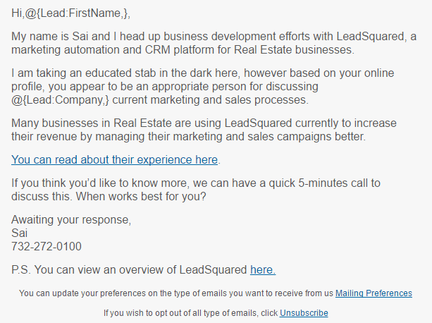
This email gave us a 543.75% increase in click rate! The open rate was good as well.
Why is this on my list?
- Personalization – Now those of you who aren’t familiar with personalization in the body of the email, this is a great example to begin with. Notice the words “@{Lead:Company,}” in the second paragraph? That’s where the reader’s ‘company name’ comes in. That automatically shows that the sales person did a bit of homework before sending out the cold outreach email and is aware of the company profile, etc.
- Validation – The copy on the CTA is what did the trick. The words “their experience” gives some sort of a validation. So even if the reader doesn’t respond immediately, he or she might look at what others have to say and then take a call.
- Targeting – Apart from mentioning the reader’s company name in the email, the sales person has also mentioned the industry. That shows this is a targeted email campaign. This further indicates that the sales person is aware of the individual’s business, industry and is perhaps well equipped to answer any questions or better understand their sales and marketing concerns.
- P.S. – The attachment of the company profile is a great idea. So now, the reader doesn’t really have to go anywhere else for more information. Think about it, if you were buying a product online, product reviews and product profile would probably be among the top five things you would look at. In this case, links to both have been shared, making it easier for the reader to understand and gather knowledge about the product.
Amazon
Amazon is an ecommerce and development platform.
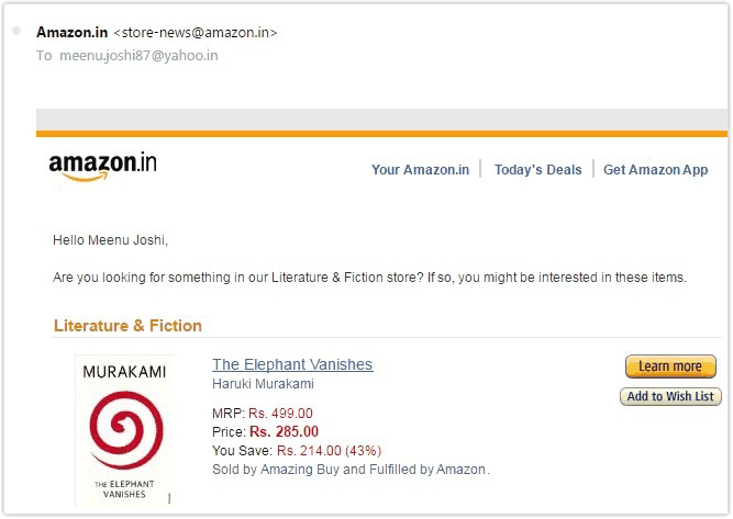
Amazon is best known for sending relevant offers based on my buying habits. And that is crucial for an ecommerce business.
Why is this on my list?
- Recommendations based on last purchase – I think this is something we all love about Amazon. They suggest and email you about things that you might actually be interested in, based on your buying habits.
- Clean interface – I’m not sure if I have used the right word here but I hope you know what I mean. I like how how clean and clear everything is, making it very easy to navigate through the mail. Compare this to other ecommerce emails you receive. You’ll see the difference.
- Button CTAs – Now since everything is plain and simple, the CTA must be different. And it is. I also like how they haven’t used the very obvious CTA of ‘Buy now’. Instead, they have given you the option of getting to know more about it.
- Product details – All necessary details of the product has been included in the email. The most important bit – the cost of the product is clearly mentioned, making is easier for the reader to take a decision.
[Also read: Email Marketing Software: An Explanatory Guide]
Quick Sprout
Quick Sprout is a SaaS company that builds software to help people increase their traffic and conversions.
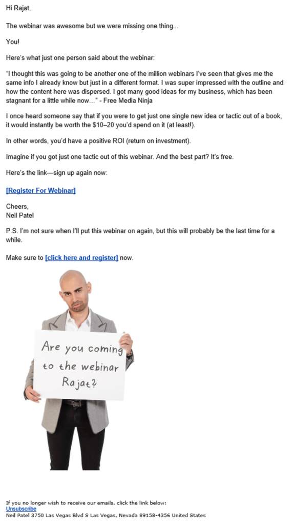
Neil Patel’s emails are always conversational, story-like and interactive. And that’s what people want to read. Try to have a conversation without actually having one.
Why is this on my list?
- Neil Patel’s expression – Come on, you can’t ignore it. Like it or not, I’m sure it caught your eye. And thereby, served the purpose.
- Copy on the white board – Notice how the white board has the reader’s name on it. I can tell you that someone who has never received a personalized mail before will get excited seeing that (basically seeing his or her name there).
- Webinar review – Having reviews of previous webinar sessions are a great way to generate interest for future sessions, especially if the reviews comes from well known figures. This adds authenticity as well.
- Introductory copy – If you notice, the mail is actually quite long and otherwise quite simple. Given the case, it’s imperative for the opening lines to captivate the reader’s attention. And it did. The words you, yours, their, theirs, them, are all great words to use in an email. Why? Because it’s not just about the business then.
So, this was my list of action-centric email marketing examples I have come across. If not a conversion, they would have certainly helped in driving engagement. In other words, after sending such an email, you can expect the reader to stick around and see what you have to offer. And overtime, if your product or service offering is compelling, they will become your customer.
