4 years ago, when I started my career in marketing, the first client I handled was an online education business. Since then, I’ve worked with dozens of them, and I’ve seen the tough realities of education marketing up close.
In particular, I have seen and analyzed my fair share of education website designs, trying to find the conversion elements that work, and the factors that make an education website click.
One pattern that I saw was that most institutions follow an antiquated website template – confusing navigation, unclear messaging and scattered information that’s not easy to access. Picture something like this.

The trend has since changed (to some extent); now you would find plenty of education and training institutes (of all kinds, traditional or new-age online ones, higher education, career schools or K12) that are doing a good job getting their point across. In this yearly round off, I have listed the best education websites in terms of clarity, user experience, design and conversion optimization. Any education or training business planning a redesign in 2016 should definitely look at these websites for inspiration. (the list follows no particular order).
#1. Savannah College of Art and Design
It’s a design institute, so you’d expect their website to be designed well too. And, they don’t disappoint at all.
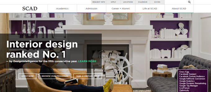
Why is Savannah College of Design on this list
Direct headline with proof of credibility
Generally, superlatives, like best, greatest are not a good idea. However, that’s not the case here. Headline reads ‘Interior design ranked No. 1 — by DesignIntelligence for the fifth consecutive year.’ It’s very clear, highlighting simultaneously the main program offered by the institute while quoting the source of the recognition.
Clear calls to action
The headline is followed by three main actions that the institute wants its most important visitor (the potential student) to take – ‘Apply Now,’ ‘Browse our Programs’ or ‘Take a Virtual Tour.’ Not many college websites do that – they leave the primary calls to action for the visitors to find, other than a generic “Apply now” throughout.
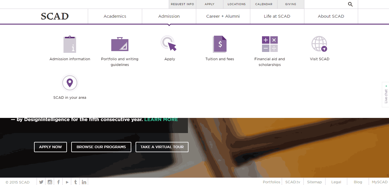
Subtle yet intuitive navigation
The navigation has been downplayed unlike many other university websites, where the main focus is the navigation before you can actually take the action. The navigation drop-down is pretty intuitive too, giving answers to the most common queries students might have.
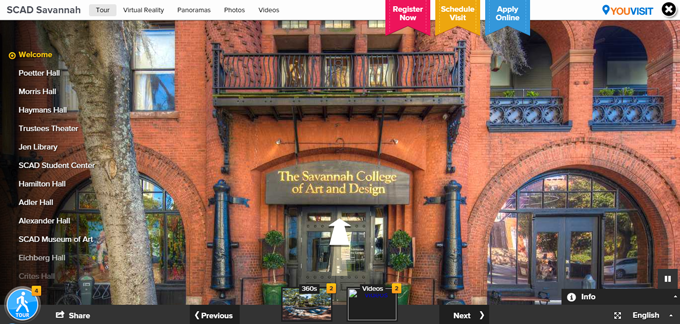
Virtual tour
SCAD has a great option of virtual tours. You can choose the campus you wish to take the tour of, and your preferred method. You can virtually tour the campus using virtual reality, videos, photos or panoramas. It’s a great way of engaging the prospective students and wowing them even before they actually step a foot inside the campus.
Consistent directional ease
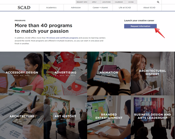
The directional ease is consistent throughout the website; for instance, if you hit “Browse our Programs,” you would be led to the following page, listing all the programs neatly, along with Location and Degree filters if the searcher wishes to get specific.
Live chat
A “Live Chat” option throughout the website further adds to good user experience, in addition to acting as a tool for first level lead generation (find more ways to generate education leads online, here.)
#2. Kendall College, Chicago
Kendall College is a traditional education institute providing specialized fields of study, like Culinary Arts, Hospitality Management, and many others, and they have done a very good job of creating a very well structured website.
Why is Kendall College on this list
Wonderful contrast of colors
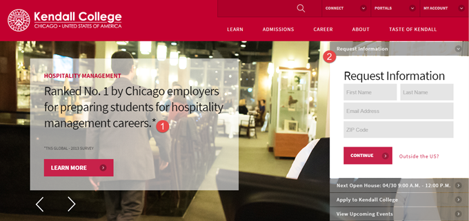
Kendall uses a beautiful red-pink-white color scheme which is contrasting, and very refreshing, thereby encouraging the prospective students to stay and read further.
Credibility element as headline
Like The Savannah College of Arts, a credibility seal from a 3rd party (this time, potential employers) forms the headline for Kendall, thus serving the dual “headline – testimonial” function again.
Clear form on the homepage
A direct, yet non-intrusive call to action (and a form) allows prospective students to request information easily. This is great because it’s unusual to see a lead capture form on an education homepage that isn’t an assault on the eyes.
Clear navigation menu
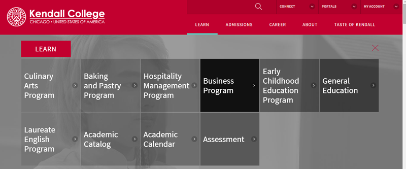
The main menu is once again comprehensive while being very easily navigable. This is a very important point, because navigation is one of the worst sufferers when it comes to education website design – so, most of the examples you’d see on this list have nailed this element perfectly.
#3. Pennsylvania Institute of Technology
There’s a lot that Pennsylvania Institute of Technology has done well with their website – great copy, a good video and all the important information in the right place.
Why is Pennsylvania Institute of Technology on this list
Great use of video
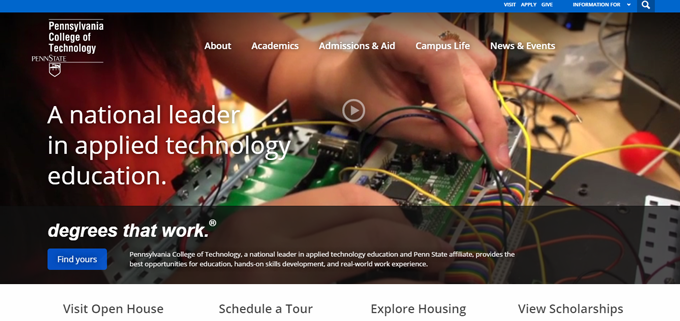
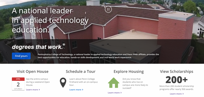
You want prospective students to know how life would be like at your college – videos are an obvious way to show that! I know videos have been overdone to the point of a cliche now. However, it’s done really well here – they have used dramatic drone shots which are very dynamic. It subtly plays in the background, showing life at the college, students and professors at work and a glimpse of the campus. It’s a great way of saying things as are, leaving an impression of no-nonsense trust and credibility.
On mobile, the video doesn’t play, which is again a great decision given that it would be intrusive on a smaller screen and would increase the page-load time.
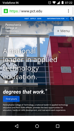
Very user-oriented CTA
A simple yet powerful “Degrees that work,” followed by the next most logical action for any prospective student “Find yours” makes a very user-oriented CTA.
There are multiple secondary CTAs as well that are downplayed yet prominent for anyone who wants to do more before browsing the courses.
Identifying & answering student queries
Many university websites fail to answer the most obvious questions running through the prospective student’s mind. Pennsylvania Institute of Technology has done a great job of identifying these questions and answering them at the right place. Instead of being buried in the navigation, important questions like “what are the scholarship options,” “when can I visit the campus,” and “what are the housing options available” are addressed very prominently below the primary CTA.
#4. Treehouse
Treehouse is a subscription-based online learning platform where people can learn coding, web designing etc. using video tutorials, assignments, community discussions among other features.
Why is TreeHouse on this list
Minimalistic design
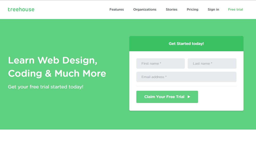
The design is simple and completely free from all distractions, driving the visitors’ focus on two things alone – the headline that clearly states what the visitor will achieve “Learn Web Design, Coding and Much More,” and the first step to get there – the “Free Trial” form.
Strong offer
Unlike their physical counterparts (universities), online education businesses cannot afford to put off capturing leads till later, and a strong offer is very important for good traffic to lead conversions. “Free trial” is a great offer for capturing the prospect’s attention and details.
Short and specific form
The form is simple, and they ask for just 2 details – name and email ID; nothing unnecessary, that would discourage people from filling the form.
The best part is they experiment consistently – I have seen them change their website every 6 months or so.
#5. Udemy
Udemy is an online learning marketplace, where you can learn (almost) absolutely anything.
Why is Udemy on this list
User involvement
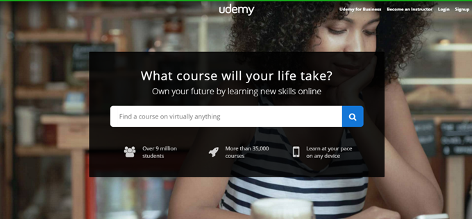
Involving the user whenever possible is key to a great browsing experience, and that’s the best thing about Udemy. They start by allowing potential learners to feed in their query/course, thus getting undivided user attention right at the starting point.
Trust elements
You can see the number of users, cost of courses etc. right on the homepage, thus adding credibility.
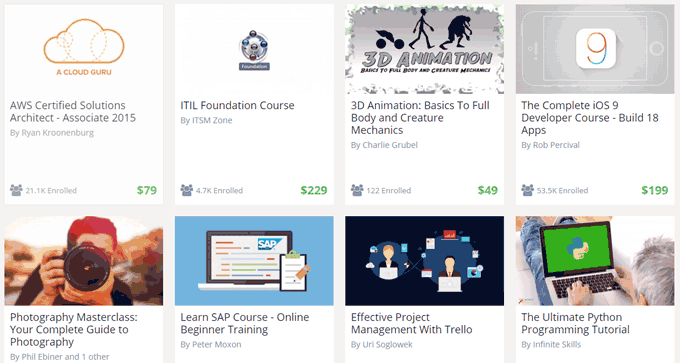
In the second fold, Udemy lists the cost + the number of people who have enrolled against each course. This adds another level of credibility (the herd effect – many people have already enrolled) and transparency (the costs are already listed).
#6. Duolingo
Duolingo is a wonderful little app that helps people learn a language with the help of simple daily tasks and tools. You can select your skill level, take assignments, and it’s a whole lot of fun to use. I stumbled upon it last year while trying to brush up my French; while that isn’t going too well, Duolingo is doing pretty good themselves – grabbing last year’s Crunchie (Tech Crunch’s awards) for Best Education Startup, and Google’s Best of the Best for 2 consecutive years, 2013 and 2014.
Why is Duolingo on this list:
Simplicity
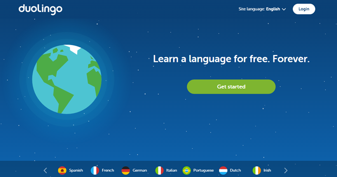
Just look at how beautifully simple everything on the home page is – simple headline, simple CTA and a simple overall layout. The app is as simple to use as the website too, so that’s a plus for student stickiness.
No unnecessary navigation
Now, what does a learner need to really get started here – choose the language for the site, and the language that they wish to learn. Apart from that, they have chucked out every navigation element – a very wise decision.
Gamification
Not only have they used Gamification inside their tool, but they have pretty dynamic user engagement elements on the website as well to keep the user hooked.
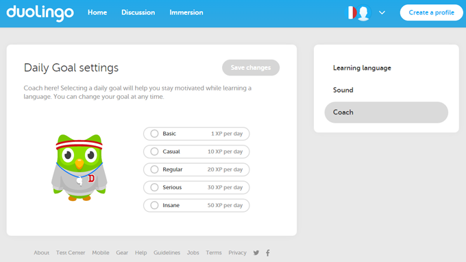
You can set goals for yourself, and choose how you wish to learn.
Within the app itself, students are awarded “points” as they go along, and “lives” are lost in case of mistakes. You make too many, and you’ll have to start over.
Engagement-first approach
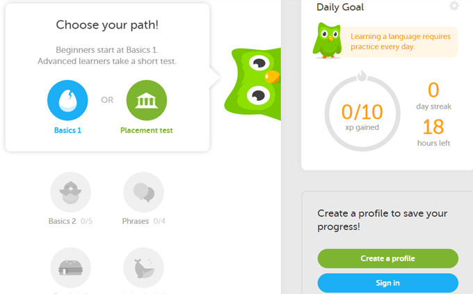
Duolingo is not jumping straight to sign ups. Everything you saw – taking a simple test, setting goals for oneself etc. are all without the user sharing any details.
They aim to engage first, and that seems to work great. People need to create a profile only while saving their progress.
#7. Code Academy
Code Academy is similar to Treehouse in what it offers – coding and web design courses.
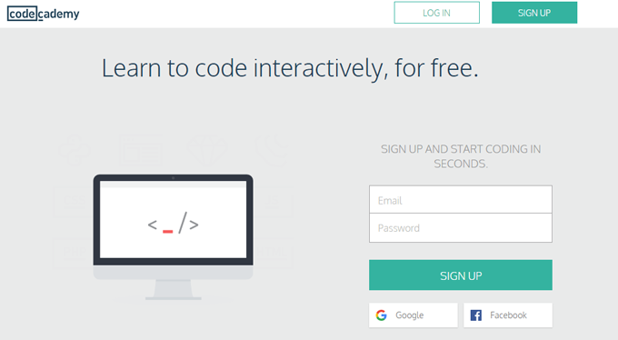
Let’s see why Code Academy is in the list
Clear message
Again, like so many other websites on the list, Code Academy has one simple, straightforward message, and no clever shenanigans, which I believe is its strongest point.
Great offer
The headline says, “Learn to code interactively, for free.” What can be a better offer than learning something for free?
Social sign up option
Depending on the business you are in, it’s a great idea to allow people to signup through their social accounts, especially when you are making them sign up for a free offer. It’s quicker and easier.
#8. Udacity
Udacity is an education marketplace for people aspiring to acquire technical skills. It has courses related to web development, data analysis, machine learning, Android and iOS development and the likes.
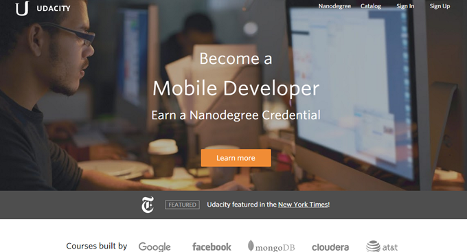
Why is Udacity in this list
Dynamic headline
When you are trying to reach out to a diverse, versatile set of audience, one way to nail it is by using dynamic titles that speak out to your different audience. We have used it during LeadSquared’s last website design too and have seen success with it.
Great offers
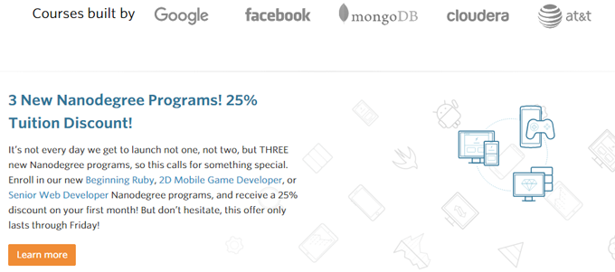
Having caught the attention of its target audience (future full stack developers, mobile developers etc.), the website offers another reason to the potential learner to enroll. An offer that says 25% off on the first month’s tuition fee.
Psychological triggers in offers
This is further complemented by another offer as the visitor scrolls down the page, in the form of 50% tuition fee returned if the learner graduates within 12 months of enrolling in the program.
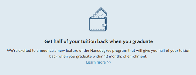
Now this is a very powerful offer for 2 reasons:
- It will entice the learners very keen on actually completing the course (half the money back is a very big deal)
- It challenges people – anything that is perceived as a challenge is a very powerful psychological trigger. Why do you think gamification works so well?
Video testimonials
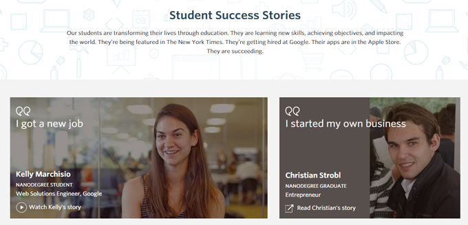
Instead of using bland text testimonials, Udacity uses video testimonials as well. When a face and an actual story replaces plain words, the testimonial becomes much more relatable for prospective students. And, Udacity has used this well.
#9. Vedantu
Vedantu is an online tutoring service with offerings like doubt clearing sessions, exam courses, and monthly tuitions.
Why is Vedantu on this list
Clear flow of actions
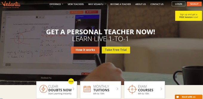
All the calls to action on the website are very neatly tied together. For instance, if you click on “How it works,” you are quickly led to make another choice “Choose your requirements,” “Choose a teacher” or “Learn one on one.” The transition from one action to the next is quick and logical.
They are prompting students to make a choice and take the subsequent action.
Clearly laid out offerings
In the first screen itself, people can also choose whether they wish to clear their doubts or choose exam courses or take monthly tuitions. There are 3 clear options, thus making it easy for students to make up their minds.
Establishing credibility
There are multiple elements of credibility on the homepage.
- Faculty: A carousel showcasing the teachers, along with the universities they hail from. Seeing names from IIT Bombay, IISc Bangalore among the faculty members increases trust.
- Achievement: The number of “happy” students learning, and the number of hours taught is another good credibility proof.
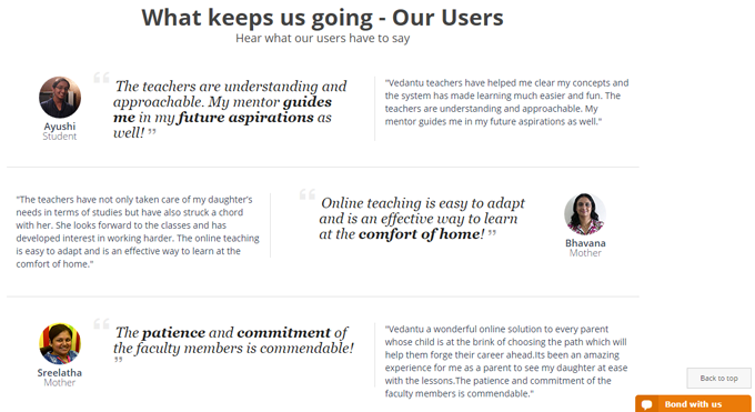
- Testimonials: There are several parent and student testimonials that do not read like a template at all, along with pictures of the person sharing the testimonial. Detailed testimonials instead of short and generic ones work better because they seem real.
#10. Khan Academy
I have kept this brilliant initiative, with a website to match towards the end, because even though it’s an education website, it’s a non-profit. But, they have several things on the website that education businesses of all kind can take inspiration from.
Why is Khan Academy on this list
Brilliant headline
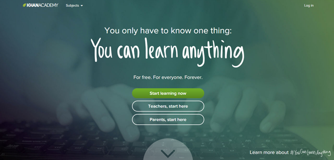
Inspirational yet direct – “…You can learn anything” is a great way to get students excited about learning on the site, which is the main aim of the initiative.
User Segmentation on the Homepage
They segment students, teachers and parents right on the homepage with 3 clear calls to action. This makes the flow of actions very straightforward. Only a few other education websites do this well.
Great use of video
I love their #YouCanLearnAnything video (it’s on the next page when you hit “Learn more about #YouCanLearnAnything”). It’s inspirational and acts as an action trigger at the perfect place – just above another “Join” button. Here’s the video if you need your daily dose of inspiration:
So, that’s it. This was my list of extremely well-designed education and training websites, along with the reasons that make them great. Have you spotted any other education website designs that get the point across, and are optimized for conversions as well? Let me know in comments.
Want us to review your website, and suggest improvements? Email me at meenu[at]leadsquared.com.
