Last week, we discussed at length about effective landing page design and its importance in deciding if a marketing campaign would work or not. Today’s article is a continuation of the previous one, and would equip you with at least the basic understanding of landing page design. Here we go!
Landing Page Design Best Practices
In case you are wondering, this is why the count starts at 6.
6) Use relevant media elements, but don’t go overboard
A short video/graphic element aligned with the prime focus of the landing page is definitely a good practice. It would help visitors understand your offering better. However, a lot of flashy content on the landing page would do nothing but distract the visitors.
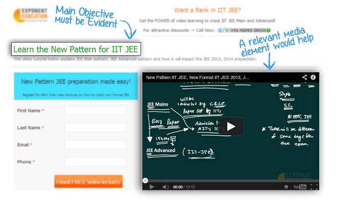
So, get to the point directly. Check out this example.

This landing page design has a video relevant to the content, however it is quite subtle, therefore does not overshadow the focus of the landing page.
7) Keep it uncluttered
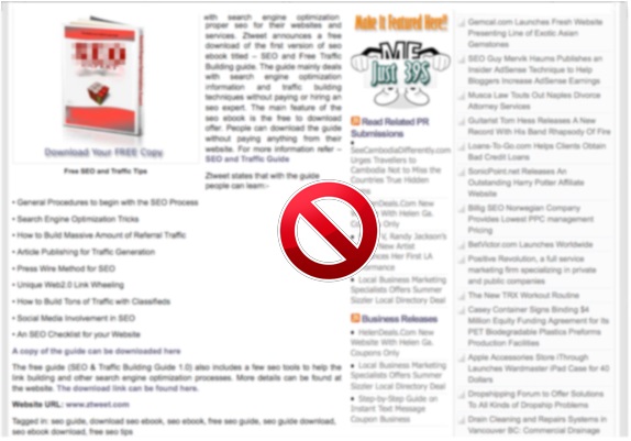
The landing page should be neat, without any unnecessary links or elements. The following landing page has a lot of content, which would confuse a visitor.
Get rid of all the elements that are not aligned with the prime focus of the landing page, and do not aid in conversion.

8) Keep the copy short and precise
You have succeeded in bringing the visitor to your landing page. Chances are the prospect does not care how full of witty wordplay the landing page is. They would want you to come to point directly, so give them what they expect.
(I hope you are not getting tired of my ‘stick to the point’ reminder already! Get used to it folks; it is THAT important). :)
9) Client testimonials
Nobody likes to hear boastful self-proclamations of your achievements. Therefore, instead of doing it yourself, let your clients vouch for you.
Testimonials can work wonders to build the visitors’ trust in the brand. However, remember to use authentic testimonials only, with a link to clients’ LinkedIn profiles.
10) Collect only vital information
Do not ask the visitors to share anything more than the most important information. A long form can put off the visitors, and the bounce rate of such landing page would be higher than normal.
11) Create a responsive landing page design
There is a digital revolution brewing, and only those who adapt will survive.
Your prospective customers spend 60% of their day on the move. You put in a lot of time and effort in catching their attention during the 40% of the day, when they have their notebooks handy. Then, why should you pass on the opportunity to catch their attention during the major part of the day? So, stop resisting, and adapt, otherwise your competitors would beat you to it. Create a mobile optimized version of each of your landing pages.

12) Social sharing buttons on landing pages
You definitely want people to talk about that free eBook you are offering. Why not make it easy for people, and give social sharing buttons on the landing page.
13) Search Engine Optimization of landing pages
You would want to spread the word about your offering; do not hesitate in optimizing your landing page for the relevant keywords.
14) Phone Number and Logo
Display your phone number and logo on the landing page. Phone number would not only give people another mode to get in touch with you, but would also increase your credibility.
Logo, on the other hand would help you maintain consistency with your website, and help your visitors identify the landing page as yours
15) Keep testing
Marketing is experimentation. You never know what would click, so keep testing. However, practice great caution, and phase out the pages that do not work; otherwise, you might be stuck in never-ending testing cycle.
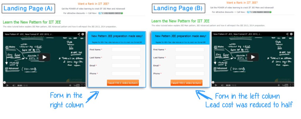
Something as simple as form placement on the landing page design can also have widely variant results. In general, a form in the right column has been reported as more effective, however moving the form from right to left column reduced the lead cost for one of our clients to half.

These were the landing pages involved in the test. Note that both the landing page designs and content are identical; except the form placement.
Therefore, here’s a thought worth remembering:
“A landing page design that works for some other business, might not work for you. Keep trying new things, and learn in the process.”
Over to you now, folks. Implement these landing page design tips, and let us know if they worked.


